Styling one widget
The visual is still a bit too generic, in most iced apps it will be a nice idea to implement a custom theme instead of using the default as we are right now, this might be a good chance to do it.
Important:
Iced themes are used to change colors, borders and such things, but not layout related stuff (padding, spacing, alignment, etc.).
But first let's see how we can style one individual widget, if you head on to Iced's docs, you'll see that the button widget theme has a few different pre-defined styles, let's try one of them, first we need to remember to import the Button theme:
use iced::theme::Button;
And we set the style by calling the .style() function in our Button like so:
button(text("Deal another card")).on_press(Message::DealCard).style(Button::Destructive)
Did you see the difference? You can try the other styles and see how they look.
But what if we want to define one style ourselves? You may have noticed that the Enum with the Button's styles has a Custom variant that takes a Box with a Stylesheet inside, if you click on the Stylesheet link in the docs page you'll see that traits' required methods, it's this that we need to implement, so let's do it:
#[derive(Default)]
struct TwentyOneButtonStyle;

impl iced::widget::button::StyleSheet for TwentyOneButtonStyle {
    type Style = iced::Theme;

    fn active(&self, _style: &Self::Style) -> button::Appearance {
        button::Appearance {
            background: Some(iced::Background::Color(color!(0xBBFF44))),
            text_color: Color::BLACK,
            ..Default::default()
        }
    }
    fn hovered(&self, _style: &Self::Style) -> button::Appearance {
        button::Appearance {
            background: Some(iced::Background::Color(color!(0x559911))),
            text_color: Color::WHITE,
            ..Default::default()
        }
    }
    fn pressed(&self, _style: &Self::Style) -> button::Appearance {
        self.hovered(_style)
    }
}
And now we can put it in a box and pass it to our button using the Custom variant of the style enum:
button(text("Deal another card")).on_press(Message::DealCard).style(Button::Custom( Box::new(TwentyOneButtonStyle)))
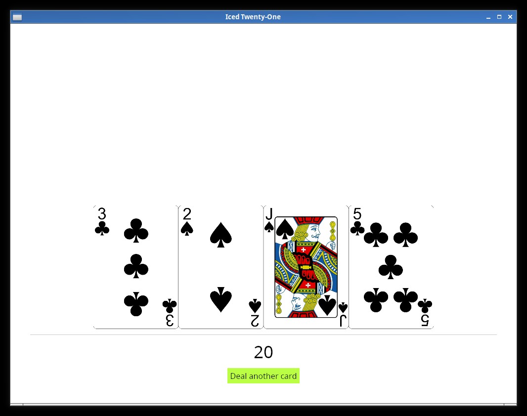
And now we have our custom Style being used. It might be a good time to play around with the different properties you can customize in the Appearance Struct.
Here we tried with a Button, but most of the other widgets have a Custom variant in their Style enum as well, and this is a quick way you can customize things.