Introduction
In this tutorial we will go from the most basic hello world and, step by step, create a 1-player twenty-one kind of game in iced, it'll be very simple, not even with a betting function, but by the end you'll be ready to implement it yourself ;)
To make your life easier, it's nice to use an IDE with autocompletion, VS Code with the rust-analyser plugin is a good option.
I'll cheat on the game logic by providing the data structures ready, since this isn't iced related.
Disclaimer:
I'm neither an iced contributor nor an experienced Rust developer, I'm writing this based on my experience using iced and on the info I've seen on iced's docs, github and discord.
Anyway, I hope this can be useful somehow.
Hello World
Let's start by creating the project:
$ cargo new iced-twentyone
Enter in this directory and, in your Cargo.toml, add the iced dependency:
[dependencies]
iced = "0.10.0"
This is the code for a minimal Hello World example, write it in your src/main.rs:
use iced::widget::{container, text};
use iced::{Sandbox, Element, Settings};
#[derive(Default)]
struct IcedTwentyOne;
#[derive(Debug, Clone, Copy)]
enum Message {
}
impl Sandbox for IcedTwentyOne {
type Message = Message;
fn new() -> Self {
Self::default()
}
fn title(&self) -> String {
String::from("Iced Twenty-One")
}
fn update(&mut self, message: Message) {
}
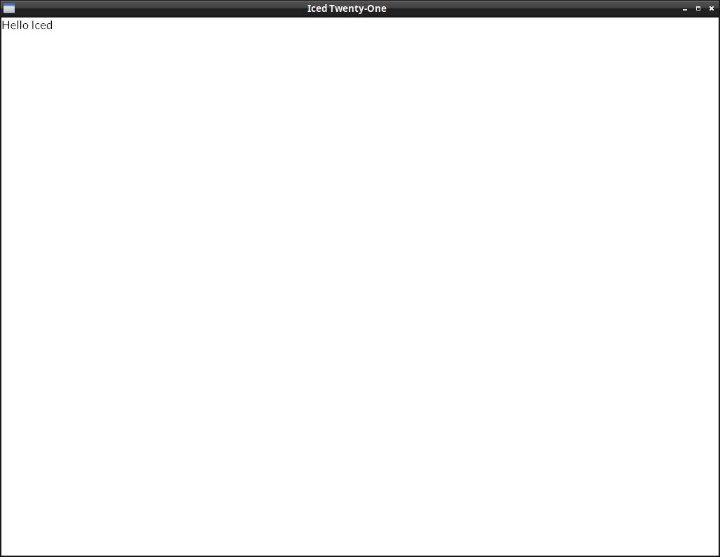
fn view(&self) -> Element<Message> {
let hello = text("Hello Iced");
container(hello).into()
}
}
pub fn main() -> iced::Result {
IcedTwentyOne::run(Settings::default())
}
Let's look into it part by part:
#[derive(Default)]
struct IcedTwentyOne;

#[derive(Debug, Clone, Copy)]
enum Message {
}
impl Sandbox for IcedTwentyOne {
Our app IcedTwentyOne has to implement the traits Sandbox or Application (Sandbox is a bit simpler and Application has a few more features, like using async and receiving initialization flags).
In Iced, a message represents a user interaction or some other relevant event (a click, selecting an item of a list, receiving updates from an async function, etc.). Our Message enum is still empty because there's no interaction at all in this hello world example.
fn update(&mut self, message: Message) {
}
The update function is where we will receive and process the messages of our application (those button clicks, radio button selections, drop down list selections, etc), but currently there's no message to process.
fn view(&self) -> Element<Message> {
    let hello = text("Hello Iced");
    container(hello).into()
}
The view function is where we define the layout of the app, in this case we have a Text widget with "Hello Iced", which we put inside a container widget and call .into() to convert it into an Element (in general you don't need to worry about this last part)
Hello World with the Application trait
It's not needed yet for this app, but in real world programs, it will be a bit more common to implement the Application trait instead of Sandbox, so let's do it in this example already, there are very few differences:
use iced::widget::{container, text};
use iced::executor;
use iced::{Application, Element, Settings, Theme, Command};

#[derive(Default)]
struct IcedTwentyOne;

#[derive(Debug, Clone, Copy)]
enum Message {
}

impl Application for IcedTwentyOne {
    type Executor = executor::Default;
    type Flags = ();
    type Message = Message;
    type Theme = Theme;

    fn new(_flags: ()) -> (IcedTwentyOne, Command<Self::Message>) {
        (IcedTwentyOne::default(), Command::none())
    }

    fn title(&self) -> String {
        String::from("Iced Twenty-One")
    }

    fn update(&mut self, _message: Self::Message) -> Command<Self::Message> {
        Command::none()
    }

    fn view(&self) -> Element<Self::Message> {
        let hello = text("Hello, Iced! (with application trait)");
        container(hello).into()
    }
}

pub fn main() -> iced::Result {
    IcedTwentyOne::run(Settings::default())
}
Not much changed, right? Usually you don't need to worry about the executor or about the flags if you don't need them, the first is the async executor used (default is fine) and the second are flags your main() may pass to your new() function when you start your iced app.
fn update(&mut self, _message: Self::Message) -> Command<Self::Message> {
    Command::none()
}
You can see that we are returning a Command::none() in the update() and new() functions, this is a Command that do nothing. Returning an actual Command is how you can execute async actions (Usually with Command::perform())
This is all the info you really need by now, but if you want, there's a few more details about the Application trait on the iced docs
Showing a Card
To don't lose time with non-iced stuff, I'll post here the data structures for the card game, it uses the rand crate, so add it to your Cargo.toml:
[dependencies]
iced = "0.10.0"
rand = "0.8.5"
And this is our card related code, save it as card.rs:
use rand::thread_rng;
use rand::seq::SliceRandom;

#[derive(Debug, Clone, Copy, PartialEq, Eq)]
pub enum Suit {
    Hearts, Diamonds, Clubs, Spades
}

#[allow(dead_code)]
impl Suit {
    pub const ALL: [Suit; 4] = [Suit::Hearts, Suit::Diamonds, Suit::Clubs,Suit::Spades];
}

impl std::fmt::Display for Suit {
    fn fmt(&self, f: &mut std::fmt::Formatter<'_>) -> std::fmt::Result {
        write!(
            f,
            "{}",
            match self {
                Suit::Hearts => "Hearts",
                Suit::Diamonds => "Diamonds",
                Suit::Clubs => "Clubs",
                Suit::Spades => "Spades",
            }
        )
    }
}

#[derive(Debug, Clone, Copy, PartialEq, Eq)]
pub enum Rank {
    Ace, Two, Three, Four, Five, Six, Seven, Eight, Nine, Ten, Jack, Queen, King
}

impl Rank {
    pub fn value(&self) -> u8 {
        match &self {
            Rank::Ace => 1, Rank::Two => 2, Rank::Three => 3,
            Rank::Four => 4, Rank::Five => 5, Rank::Six => 6,
            Rank::Seven => 7, Rank::Eight => 8, Rank::Nine => 9,
            Rank::Ten => 10, Rank::Jack => 10, Rank::Queen => 10,
            Rank::King => 10,
        }
    }
    pub const ALL: [Rank; 13] =
        [Rank::Ace, Rank::Two, Rank::Three, Rank::Four, Rank::Five,
        Rank::Six, Rank::Seven, Rank::Eight, Rank::Nine, Rank::Ten,
        Rank::Jack, Rank::Queen, Rank::King];
}

impl std::fmt::Display for Rank {
    fn fmt(&self, f: &mut std::fmt::Formatter<'_>) -> std::fmt::Result {
        write!(f, "{}",
            match self {
                Rank::Ace => "Ace", Rank::Two => "Two",
                Rank::Three => "Three", Rank::Four => "Four",
                Rank::Five => "Five", Rank::Six => "Six",
                Rank::Seven => "Seven", Rank::Eight => "Eight",
                Rank::Nine => "Nine", Rank::Ten => "Ten",
                Rank::Jack => "Jack", Rank::Queen => "Queen",
                Rank::King => "King",
            }
        )
    }
}

#[derive(Debug, Clone, Copy, PartialEq, Eq)]
pub struct Card {
    suit: Suit,
    rank: Rank,
}

impl Card {
    #[allow(dead_code)]
    pub fn new(suit: Suit, rank: Rank) -> Self {
        Self {suit, rank}
    }

    #[allow(dead_code)]
    pub fn get_id(&self) -> String {
        format!("{}_of_{}", self.rank.to_string(), self.suit.to_string())
    }
}

impl std::fmt::Display for Card {
    fn fmt(&self, f: &mut std::fmt::Formatter<'_>) -> std::fmt::Result {
        write!(f, "{} of {}", self.rank, self.suit)
    }
}

#[derive(Debug, Clone)]
pub struct Deck {
    cards: Vec<Card>,
}

impl Default for Deck {
    fn default() -> Deck {
        Deck::new()
    }
}

impl Deck {
    pub fn new() -> Self {
        let mut deck = Vec::new();
        for rank in Rank::ALL {
            for suit in Suit::ALL {
                deck.push(Card {rank, suit});
            }
        }
        Deck {cards: deck}
    }

    pub fn shuffle(&mut self) {
        self.cards.shuffle(&mut thread_rng());
    }
    pub fn deal_card(&mut self) -> Option<Card> {
        self.cards.pop()
    }
}

#[allow(dead_code)]
#[derive(Debug, Clone)]
pub struct Hand {
    pub soft: bool,
    pub cards: Vec<Card>,
}

#[allow(dead_code)]
impl Hand {
    pub fn new() -> Self {
        Self { cards: Vec::new(), soft: false }
    }
    pub fn value(&self) -> u8 {
        let mut hand_value = if self.soft {
            10
        } else {
            0
        };
        for card in &self.cards {
            hand_value = hand_value + card.rank.value();
        }
        hand_value
    }
    pub fn push(&mut self, card: Card) {
        if card.rank == Rank::Ace && self.value() < 11 {
            self.soft = true;
        }
        self.cards.push(card);
        if self.soft && self.value() > 21 {
            self.soft = false;
        }
    }
    pub fn pop(&mut self) -> Option<Card> {
        self.cards.pop()
    }
    pub fn is_blackjack(&self) -> bool {
        if self.cards.len() == 2 && self.value() == 21 {
            true
        } else {
            false
        }
    }
}
Showing the Card as text
Now let's go back to our iced application, just for starters, let's replace the "Hello Iced" message with a random card.
For this, in our app state (our IcedTwentyOne struct) we will have two fields, a deck and our hand (the deck field not being used yet, but let's add it already).
mod card;
use card::{Deck, Hand};

struct IcedTwentyOne {
    deck: Deck,
    player_hand: Hand,
}
Notice that we aren't using the #[derive(Default)] anymore. We will start implementing the Default trait ourselves, in our Default state we start the deck, suffle the cards, and draw one to our hand.
impl Default for IcedTwentyOne {
    fn default() -> IcedTwentyOne {
        let mut deck = Deck::new();
        let mut hand = Hand::new();
        deck.shuffle();
        hand.push(deck.deal_card().unwrap());
        IcedTwentyOne {
            deck: deck,
            player_hand: hand,
        }
    }
}
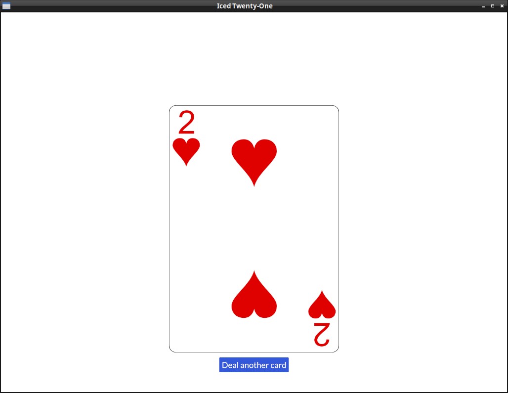
And now that the card is there, we can show it on our view():
fn view(&self) -> Element<Self::Message> {
    let card = text(self.player_hand.cards[0]);
    container(card).into()
}
Each time you run the app, you should see a different Card, try it!
This is the full code as of now, it's only showing the things we changed, but you can click on the eye button to see the whole content.
use iced::widget::{container, text};
use iced::executor;
use iced::{Application, Element, Settings, Theme, Command};

mod card;
use card::{Deck, Hand};

struct IcedTwentyOne {
    deck: Deck,
    player_hand: Hand,
}

impl Default for IcedTwentyOne {
    fn default() -> IcedTwentyOne {
        let mut deck = Deck::new();
        let mut hand = Hand::new();
        deck.shuffle();
        hand.push(deck.deal_card().unwrap());
        IcedTwentyOne {
            deck: deck,
            player_hand: hand,
        }
    }
}


#[derive(Debug, Clone, Copy)]
enum Message {
}

impl Application for IcedTwentyOne {
   type Executor = executor::Default;
   type Flags = ();
   type Message = Message;
   type Theme = Theme;

   fn new(_flags: ()) -> (IcedTwentyOne, Command<Self::Message>) {
       (IcedTwentyOne::default(), Command::none())
   }

   fn title(&self) -> String {
       String::from("Iced Twenty-One")
   }

   fn update(&mut self, _message: Self::Message) -> Command<Self::Message> {
       Command::none()
   }

    fn view(&self) -> Element<Self::Message> {
        let card = text(self.player_hand.cards[0]);
        container(card).into()
    }
}

pub fn main() -> iced::Result {
   IcedTwentyOne::run(Settings::default())
}
Showing a card as image
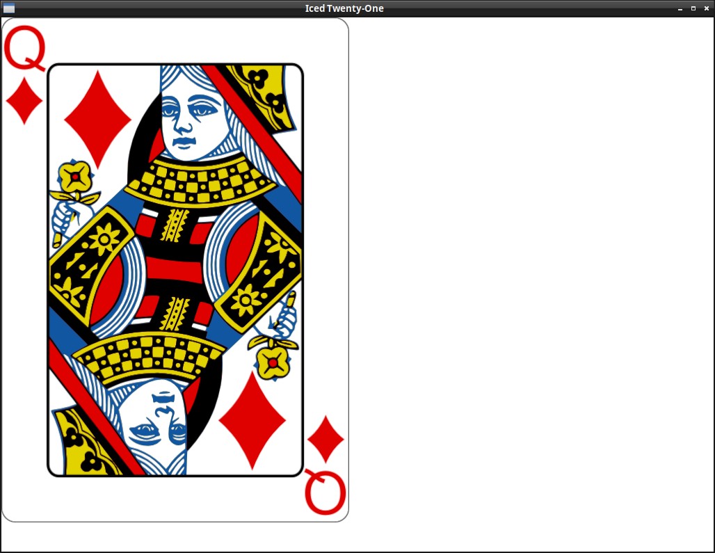
By now your eyes are probably hurting a bit with how ugly the interface looks, so, before we continue, let's draw some nice images instead of just writing the card info.
We will use the card images from this project, just renamed to our needs. Download the "img" folder from here and extract it to your project's directory.
To show images in iced you need to use the iced feature image (or the feature svg if the images are svgs). Add it now to your Cargo.toml:
[dependencies]
iced = {version = "0.8.0", features = ["image"] }
rand = "0.8.4"
In the code we just need to import the image function instead of the text one:
use iced::widget::{container, image};
And pass the image file location to the function image, which will return our Image widget (or you can use Image::new(), the function is just a shorthand for it):
fn view(&self) -> Element<Self::Message> {
    let card = image(String::from("img/") + &self.player_hand.cards[0].get_id() + ".png");
    container(card).into()
}
Starting to change the layout
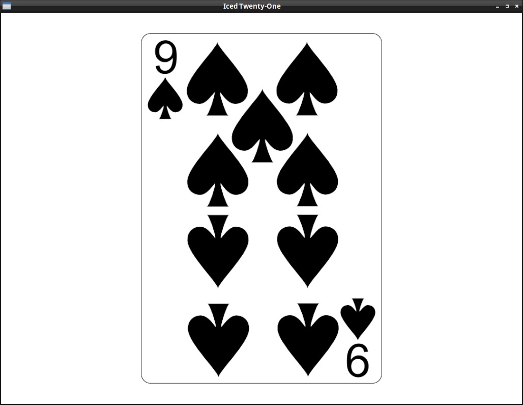
Now the image is being displayed, but we could improve a bit the layout already, let's try to change the container like this:
container(card)
    .width(Length::Fill)
    .height(Length::Fill)
    .align_y(Vertical::Bottom)
    .center_x()
    .padding(40)
    .into()
And remember to add the new imports (in general Rust or your IDE will suggest these new imports to you, so I'll omit them going forward):
use iced::{executor, Length};
use iced::alignment::Vertical;
About the container changes:
paddingis self explanatory, but nice to point out that it's space you leave inside the container's bondaries. (so e.g. if the container has a background color, the padded area will still be colored)..align_y(Vertical::Bottom)Place the container's content at the bottom vertically.center_x()center the container's content horizontally.
Considering that the center is centering the content that's inside the container, it only makes sense if there's empty room left in the container to center things around. The default behaviour on width and height is to shrink to the content though, so that's why we also needed:
.width(Length::Fill)The container will fill all the remaining horizontal space (in this case, of the window, since it's not inside anything)..height(Length::Fill)The container will fill all the remaining vertical space.
Drawing a card - Receiving our first Message
It's a bit clunky to have to restart the app to get another card, isn't it? It would be better to have a button to deal another one, so let's do it! This will also be our first time receiving a message in our application.
We can start by creating the Button itself. To organize our widgets, we will be using a Column now, the column! macro is a shorthand to create a Column widget containing all the widgets we pass inside the array it receives.
Since rust-analyzer (the thing that checks for errors, if you're on an IDE) may confuse the iced column! macro with the unrelated Rust one, I imported it with another name ("col") here:
use iced::widget::{image, container, button, text, column as col};

fn view(&self) -> Element<Self::Message> {

    let img_path = String::from("img/") + &self.player_hand.cards[0].get_id() + ".png";

    let table_col = col![
        image(img_path).height(Length::Fixed(500.)),
        button(text("Deal another card")),
    ].align_items(iced::Alignment::Center).spacing(10);

    container(table_col)
        .width(Length::Fill)
        .height(Length::Fill)
        .align_y(Vertical::Bottom)
        .center_x()
        .padding(40)
        .into()
}
New things:
-
.align_items(iced::Alignment::Center)- Center the content of the column horizontally ("The container is already centered, so why do we need this?" Try removing it and you'll notice) -
.spacing(10)- Spacing between the elements of the column (So there's a bit of room between card and button). You may wonder what's the difference between spacing and padding, to answer this, try replacing this spacing with a .padding(10) on the button. -
height(Length::Fixed(500.))The card image itself is big enough that it wouldn't leave room for the button if we used it's total size, so we resize it to 500 height. Try removing this and see what happens.
If you run the program now, you'll notice that the button is currently grayed out. This is because we haven't passed anything to the button's on_press() function yet, so nothing can happen. Not calling .on_press() is actually how you disable a button.
But now it's time to finally create our "deal card" Message and process this event, let's update our Message enum like so:
enum Message {
    DealCard
}
And change the view to tell the button that he needs to create a DealCard message when someone clicks on it:
button(text("Deal another card")).on_press(Message::DealCard)
Now that the button is generating the Message::DealCard, we need to process it in our update():
fn update(&mut self, message: Self::Message) -> Command<Self::Message> {
    match message {
        Message::DealCard => {
            if let Some(new_card) = self.deck.deal_card() {
                self.player_hand.pop();
                self.player_hand.push(new_card);
            }
        }
    }
    Command::none()
}
If we receive a DealCard message, we try to deal another card, if we're sucessfull (if there's cards left), we replace the card in our hand with this new one (it's not how the game actually works, but we'll get a bit closer in the next chapter).
As an exercise, you may want to disable the button if there are no more cards left in the deck.
A proper hand, with multiple cards
First let's show the value of our hand on the GUI, to make it a bit more pretty, we'll also introduce a new widget, Rule (don't forget to import it), that draws a vertical or horizontal line, used for separation:
fn view(&self) -> Element<Self::Message> {

    let img_path = String::from("img/") + &self.player_hand.cards[0].get_id() + ".png";

    let table_col = col![
        image(img_path).height(Length::Fixed(500.)),
        Rule::horizontal(4.),
        text(self.player_hand.value().to_string()).size(35),
        button(text("Deal another card")).on_press(Message::DealCard)
    ].align_items(iced::Alignment::Center).spacing(10);
The .size(35) is what you would expect, it changes the size of the text.
You can run the app now, you'll see that the value is displayed.
But we want a hand with multiple cards, as we will need in the actual game, so let's stop removing the previous card, just delete the pop() line we had on our update function:
fn update(&mut self, message: Self::Message) -> Command<Self::Message> {
    match message {
        Message::DealCard => {
            if let Some(new_card) = self.deck.deal_card() {
                self.player_hand.push(new_card);
Up to now, we had being using the shorthand functions that return us the actual widget, they make the code less verbose, but when it's not exactly known which or how many widgets we'll have inside a Column, or Row, we need to use it's new() and push() functions instead.
fn view(&self) -> Element<Self::Message> {

    let mut player_row = Row::new();
    for card in &self.player_hand.cards {
        player_row = player_row.push(image(String::from("img/") + &card.get_id() + ".png").height(Length::Fixed(250.)));
    }

    let table_col = col![
        player_row,
        Rule::horizontal(4.),
        text(self.player_hand.value().to_string()).size(35),
        button(text("Deal another card")).on_press(Message::DealCard)
    ].align_items(iced::Alignment::Center).spacing(10);
Here we created the Row first, with Row::new() iterate over the cards in our hand and call .push() to add each one to the row. We then add the Row (instead of the Image directly as before) to the "player_col" Column.
Styling one widget
The visual is still a bit too generic, in most iced apps it will be a nice idea to implement a custom theme instead of using the default as we are right now, this might be a good chance to do it.
Important:
Iced themes are used to change colors, borders and such things, but not layout related stuff (padding, spacing, alignment, etc.).
But first let's see how we can style one individual widget, if you head on to Iced's docs, you'll see that the button widget theme has a few different pre-defined styles, let's try one of them, first we need to remember to import the Button theme:
use iced::theme::Button;
And we set the style by calling the .style() function in our Button like so:
button(text("Deal another card")).on_press(Message::DealCard).style(Button::Destructive)
Did you see the difference? You can try the other styles and see how they look.
But what if we want to define one style ourselves? You may have noticed that the Enum with the Button's styles has a Custom variant that takes a Box with a Stylesheet inside, if you click on the Stylesheet link in the docs page you'll see that traits' required methods, it's this that we need to implement, so let's do it:
#[derive(Default)]
struct TwentyOneButtonStyle;

impl iced::widget::button::StyleSheet for TwentyOneButtonStyle {
    type Style = iced::Theme;

    fn active(&self, _style: &Self::Style) -> button::Appearance {
        button::Appearance {
            background: Some(iced::Background::Color(color!(0xBBFF44))),
            text_color: Color::BLACK,
            ..Default::default()
        }
    }
    fn hovered(&self, _style: &Self::Style) -> button::Appearance {
        button::Appearance {
            background: Some(iced::Background::Color(color!(0x559911))),
            text_color: Color::WHITE,
            ..Default::default()
        }
    }
    fn pressed(&self, _style: &Self::Style) -> button::Appearance {
        self.hovered(_style)
    }
}
And now we can put it in a box and pass it to our button using the Custom variant of the style enum:
button(text("Deal another card")).on_press(Message::DealCard).style(Button::Custom( Box::new(TwentyOneButtonStyle)))
And now we have our custom Style being used. It might be a good time to play around with the different properties you can customize in the Appearance Struct.
Here we tried with a Button, but most of the other widgets have a Custom variant in their Style enum as well, and this is a quick way you can customize things.
Iced Dark and Custom themes
Do you dislike white backgrounds like me? If you do, you're lucky, Iced has a built-in Dark theme, the Application trait has an optional theme() function that we can use to specify which Theme variant we want to use, let's try it:
fn theme(&self) -> Self::Theme {
    Theme::Dark
}
If you run the app now, you'll see that the dark theme is being used (together with our custom button style).
But what if we want to customize things further? As was the case with the button, you can see in the Iced docs for iced::Theme that it also has a Custom variant, let's use that, for this we change our theme() function like this:
fn theme(&self) -> Self::Theme {
    Theme::Custom(Box::new(
        iced::theme::Custom::new(
            iced::theme::Palette {
                background: color!(0x114411),
                text: color!(0xCCFFCC),
                primary: color!(0xffffff),
                success: color!(0xffffff),
                danger: color!(0xCC0000),
            }
        )
    ))
}
You'll see now that the colors have changed. Here there's one very interesting thing to notice, try changing the text color on the pallete to black (0x000000) did you see something strange in the color of our hand value? Iced makes sure that the text is readable, so it won't respect the value we set there if it makes the text impossible to read (which does't happen with the Rule widget, you may have noticed that it did change to black).
Things like the "danger" color are used in some widget's own styles, if for example you try to use the Button::Destructive Style variant right now:
button(text("Deal another card")).on_press(Message::DealCard).style(Button::Destructive)
You'll see that our danger color will be used.
A full custom Theme
What we saw so far was already quite useful, but if we want to have full flexibility in our app's appearance, we need to create our own custom theme, this is a bit complex, so don't feel discouraged if it take a while to understand things. The most cumbersome thing in this is that since we are creating a complete different theme, we will need to specify a stylesheet for every widget we use in our app (each one is just like the stylesheet we made for our button in the styling chapter).
Important:
Iced themes are used to change colors, borders and such things, but not layout related stuff (padding, spacing, alignment, etc.).
How it works:
As we saw in Chapter 5, for each iced widget, there's a different StyleSheet trait with rules about it's styling. Those traits return an Appearance struct (which is different for each widget). This is the trait signature of the iced::widget::button::StyleSheet as you may remember from that chapter:
pub trait StyleSheet {
    type Style: Default;

    // Required method
    fn active(&self, style: &Self::Style) -> Appearance;

    // Provided methods
    fn hovered(&self, style: &Self::Style) -> Appearance { ... }
    fn pressed(&self, style: &Self::Style) -> Appearance { ... }
    fn disabled(&self, style: &Self::Style) -> Appearance { ... }
}
(Appearance is an iced::widget::button::Appearance)
What we need to do is make an enum representing our new Theme, and implement these stylesheet traits for the widgets we use on our app, the structure will look like this:
#[derive(Debug, Clone, Copy, PartialEq, Eq, Default)]
pub enum OurTheme {
    #[default]
    DefaultVariant, //We can have many, for example to have Dark and Light variants
}

impl application::StyleSheet for OurTheme {
    type Style = ();

    fn appearance(&self, _style: &Self::Style) -> application::Appearance { ... }
}

impl button::StyleSheet for OurTheme {
    type Style = ();
    fn active(&self, _style: &Self::Style) -> button::Appearance { ... }}
    fn hovered(&self, _style: &Self::Style) -> button::Appearance { ... }}
    fn pressed(&self, _style: &Self::Style) -> button::Appearance { ... }}
}

impl container::StyleSheet for OurTheme {
    type Style = ();
    fn appearance(&self, _style: &Self::Style) -> container::Appearance { ... }}
}
...
But let's get back to the actual code, this here will be our starting point, save it as theme.rs:
use iced::widget::{button, container, text, rule};
use iced::{application, Color, color};

#[derive(Debug, Clone, Copy, PartialEq, Eq, Default)]
pub enum TwentyOneTheme {
    #[default]
    Green,
}

impl application::StyleSheet for TwentyOneTheme {
    type Style = ();

    fn appearance(&self, _style: &Self::Style) -> application::Appearance {
        application::Appearance {
            background_color: color!(0x477c47),
            text_color: Color::BLACK,
        }
    }
}

impl button::StyleSheet for TwentyOneTheme {
    type Style = ();

    fn active(&self, _style: &Self::Style) -> button::Appearance {
        button::Appearance {
            background: Some(iced::Background::Color(color!(0xFFFFFF))),
            text_color: Color::BLACK,
            ..Default::default()
        }
    }
    fn hovered(&self, _style: &Self::Style) -> button::Appearance {
        button::Appearance {
            background: Some(iced::Background::Color(color!(0x324731))),
            text_color: Color::WHITE,
            ..Default::default()
        }
    }
    fn pressed(&self, _style: &Self::Style) -> button::Appearance {
        self.hovered(_style)
    }
}

impl container::StyleSheet for TwentyOneTheme {
    type Style = ();

    fn appearance(&self, _style: &Self::Style) -> container::Appearance {
        container::Appearance {
                text_color: Some(Color::WHITE),
                ..Default::default()
        }
    }
}

impl text::StyleSheet for TwentyOneTheme {
    type Style = ();

    fn appearance(&self, _style: Self::Style) -> text::Appearance {
        text::Appearance::default()
    }
}

impl rule::StyleSheet for TwentyOneTheme {
    type Style = ();

    fn appearance(&self, _style: &Self::Style) -> rule::Appearance {
        rule::Appearance {
            color: Color::WHITE,
            width: 1,
            radius: 0.0.into(),
            fill_mode: rule::FillMode::Full,
        }
    }
}
I know, I know, it's quite verbose, but on the bright side, it's not too hard to understand and you generally can copy the default Theme stylesheets from iced or examples like this one and just change the values you are interested in.
A few comments on the theme code:
- Our TwentyOneTheme has a default (and currently, only) green variant, we will create more variants later.
- A few widgets'
Appearancestruct don't implDefault, here for example we had to define every field of theRule, even though we didn't care much about them. This will probably change in the future. - As we saw on chapter 5, the point of the
StyleType inside eachStyleSheetis that we may have a few different styles, e.g. if we had a "TableStyle" and a "MenuStyle" for the buttons, in ourview()we could just pass the style we want with.style(theme::ButtonStyle). Later we will try this!
A few more tips about this:
- Using an IDE is a big help, you can press
Ctrl+Spaceon VS Code while creating eachAppearancestruct to see the fields available and play with them. - Pay attention to the documentation text, it's short but very helpful.
- Some stylesheet (like the
picklistone) are more complicated and demand other elements, you can take a look at the default iced theme to check how it does things.
To use this Theme we need a couple changes to our Application, but first delete the theme() method, we won't need it for now, and the custom button style we created before (and the .style() call), we will do everything on our custom theme from now on. The first change is that we obviously replace the Theme type with our own.
mod theme;

...

impl Application for IcedTwentyOne {
    type Executor = executor::Default;
    type Flags = ();
    type Message = Message;
    type Theme = theme::TwentyOneTheme;
But in our view arguments we also need to specify that we're using it and not iced's default:
fn view(&self) -> Element<Message, iced::Renderer<theme::TwentyOneTheme>> {
Don't worry about the iced::Renderer part, you don't need to deal with the renderer yourself, it's just that we needed to change the generic it uses.
Maximizing & Window modes
After the marathon of the last chapter, let's do something simple.
To start adding the game logic, it'll be nice to have more screen space to work with, so let's start the window maximized, we just need to pass iced::window::maximize(true) on our new():
fn new(_flags: ()) -> (IcedTwentyOne, Command<Self::Message>) {
    (IcedTwentyOne::default(), iced::window::maximize(true))
}
Talking about iced::window, we can take a look at how to to make the program fullscreen, it's quite similar:
fn new(_flags: ()) -> (IcedTwentyOne, Command<Self::Message>) {
    (IcedTwentyOne::default(), iced::window::change_mode(iced::window::Mode::Fullscreen))
}
We're using the new() function, but what if we wanted to change these things after the app is running? Notice that the update() function returns a Command<Self::Message>, just like the 2nd item in the tuple we return in new(), so we can just do the same there, you can try it out now if you want.
Take a look at the documentation of iced::Window if you want to learn more.
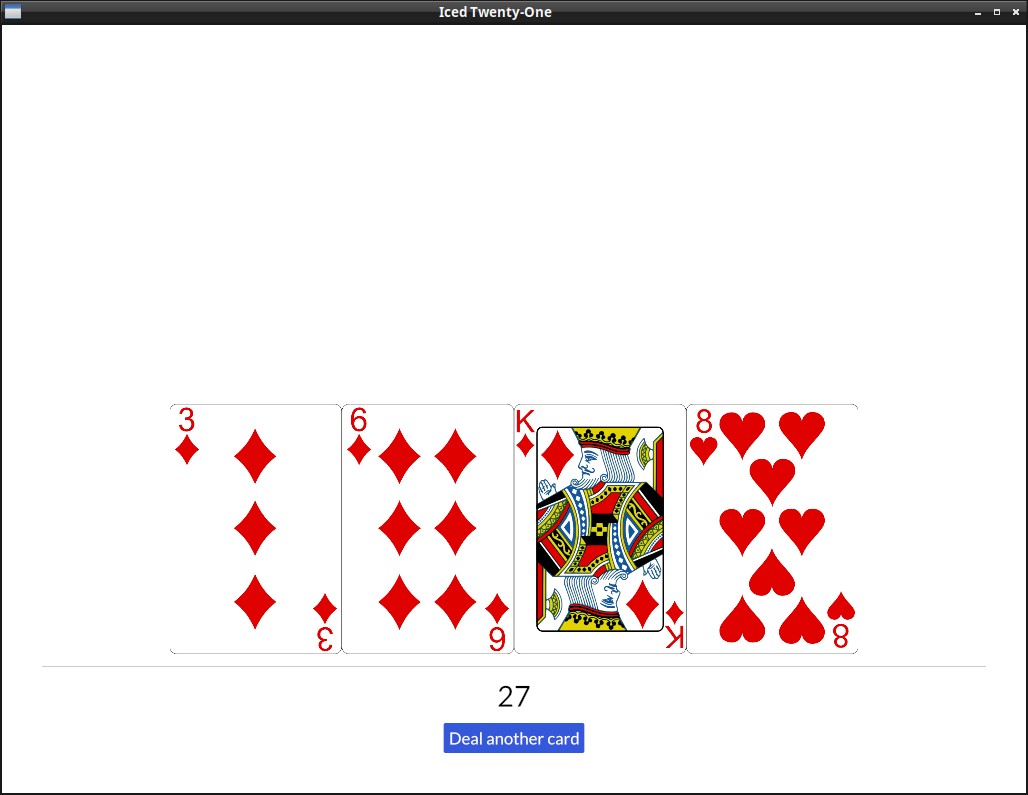
Adding the dealer's hand
Going on with the actual game functions, it's about time we create and show the dealer's hand, we can just copy paste what we have from the player's hand, let's start by adding the dealer's hand to our state:
struct IcedTwentyOne {
    deck: Deck,
    player_hand: Hand,
    dealer_hand: Hand,
}
And start the dealer's hand the same way we did for the player's:
impl Default for IcedTwentyOne {
    fn default() -> IcedTwentyOne {
        let mut deck = Deck::new();
        let mut player = Hand::new();
        let mut dealer = Hand::new();
        deck.shuffle();
        player.push(deck.deal_card().unwrap());
        player.push(deck.deal_card().unwrap());
        dealer.push(deck.deal_card().unwrap());
        dealer.push(deck.deal_card().unwrap());

        IcedTwentyOne {
            deck: deck,
            player_hand: player,
            dealer_hand: dealer
        }
    }
}
And now that the state is there, we can show it on our view() just like the player's hand:
fn view(&self) -> Element<Message, iced::Renderer<theme::TwentyOneTheme>> {
    let mut dealer_row = Row::new();
    for card in &self.dealer_hand.cards {
        dealer_row = dealer_row.push(image(String::from("img/") + &card.get_id() + ".png").height(Length::Fixed(250.)));
    }
And add the dealer's info to the table_col too, again, just like we did the player's, including also the hand value:
    let table_col = col![
        text(self.dealer_hand.value().to_string()).size(35),
        Rule::horizontal(4.),
        dealer_row,
        player_row,
        Rule::horizontal(4.),
        text(self.player_hand.value().to_string()).size(35),
        button(text("Deal another card")).on_press(Message::DealCard),
    ].align_items(iced::Alignment::Center).spacing(10);
Improving the layout further
This is starting to look like the actual game should, but the layout could look better don't you think? There's no reason for both rands to be so glued together and have all that space on the top.
This is how our layout is structured now:
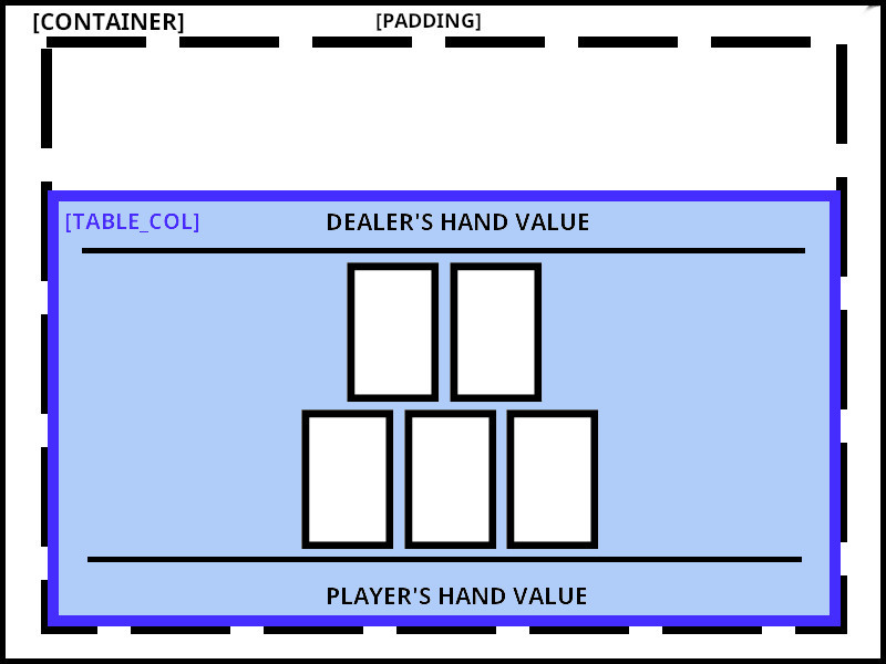
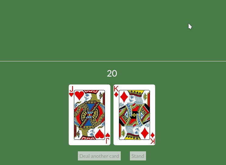
Having all in the bottom was ok when we had only the player's hand, but now the dealer's hand is also inside the "table_col", it would be better to have it on top instead.
To do this, we'll have to separate our current table_col in two, a "dealer_info" container and a "player_info" one, one aligned to the top (with align_y(Vertical::Top) and the other to the bottom (with .align_y(Vertical::Bottom)). Inside each of these container we will have our column, with the hand value, rule and Row of cards, similar to what we have now:
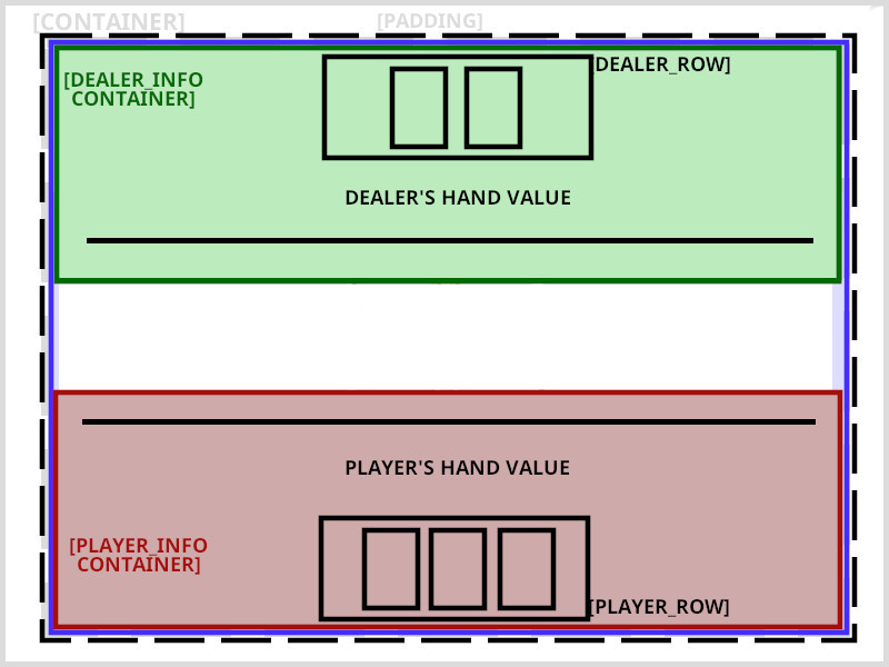
For clarity I ommited the Column inside each container, since it's only there to stack the elements on top of each other.
Since there will be a Column right there inside the Container you may wonder why do we need to have it wrapped inside a Container at all. Well, these align functions are only present in the Container, so it's common to wrap things inside one to decorate them.
This is our updated view with these changes:
fn view(&self) -> Element<Message, iced::Renderer<theme::TwentyOneTheme>> {

    let mut dealer_row = Row::new().spacing(10);
    for card in &self.dealer_hand.cards {
        dealer_row = dealer_row.push(image(String::from("img/") + &card.get_id() + ".png").height(Length::Fixed(200.)));
    }

    let dealer_info = container(
        col![
            dealer_row,
            text(self.dealer_hand.value().to_string()).size(35),
            Rule::horizontal(4.),
        ].width(Length::Fill).align_items(iced::Alignment::Center).spacing(20)
    ).height(Length::Fill).align_y(Vertical::Top);

    let mut player_row = Row::new().spacing(10);
    for card in &self.player_hand.cards {
        player_row = player_row.push(image(String::from("img/") + &card.get_id() + ".png").height(Length::Fixed(200.)));
    }
    let player_info = container(
        col![
            Rule::horizontal(4.),
            text(self.player_hand.value().to_string()).size(35),
            player_row,
            button(text("Deal another card")).on_press(Message::DealCard),
        ].width(Length::Fill).align_items(iced::Alignment::Center).spacing(20)
    ).height(Length::Fill).align_y(Vertical::Bottom);

    let table_col = col![
        dealer_info,
        player_info,
    ].align_items(iced::Alignment::Center).spacing(10);

    container(table_col)
        .width(Length::Fill)
        .height(Length::Fill)
        .center_y()
        .padding(40)
        .into()
}
Since we are at it, I added a bit of spacing (.spacing(10)) between each card, as you may have noticed.
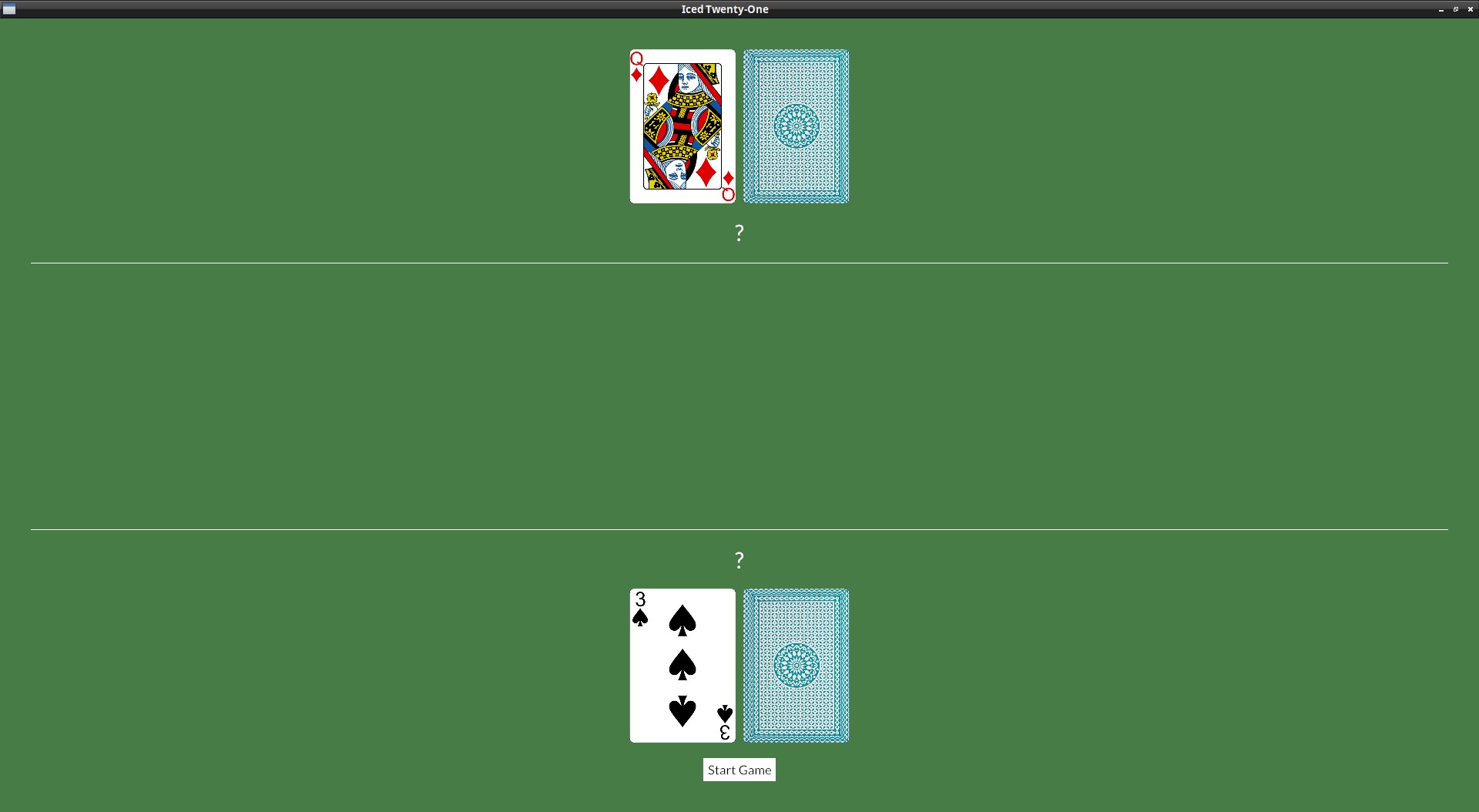
Start with the second card facing down
Dealer's hand
We shouldn't be seeing the second card right away, let's fix this.
For the dealer's hand it's quite simple for now, since they're always with 2 cards, we can just change it to:
let dealer_row = row![
    image(String::from("img/") + &self.dealer_hand.cards[0].get_id() + ".png").height(Length::Fixed(200.)),
    image(String::from("img/back.png")).height(Length::Fixed(200.))
].spacing(10);
And let's hide the dealer's hand value as well, otherwise there's no point in hiding the card:
let dealer_info = container(
    col![
        dealer_row,
        text("?").size(35),
        Rule::horizontal(4.),
Player's hand
Our hand is a bit more tricky, since there's more to do already.
This initial dealing of the 2 cards and the later part with the player dealing cards have quite a number of different UI elements, so perhaps it's good to have a way to know in which part of the game we're on, let's create a new enum to indicate in which stage of the game we're in and add it to our app's state:
(I'm only showing the changed lines, but you can click on the eye button to see everything)
#[derive(PartialEq)]
enum GameStage {
    Init, Dealing
}

struct IcedTwentyOne {
   deck: Deck,
   player_hand: Hand,
   dealer_hand: Hand,
    game_stage: GameStage,
}
impl Default for IcedTwentyOne {
    fn default() -> IcedTwentyOne {
       let mut deck = Deck::new();
       let mut player = Hand::new();
       let mut dealer = Hand::new();
       deck.shuffle();
       player.push(deck.deal_card().unwrap());
       player.push(deck.deal_card().unwrap());
       dealer.push(deck.deal_card().unwrap());
       dealer.push(deck.deal_card().unwrap());

        IcedTwentyOne {
           deck: deck,
           player_hand: player,
           dealer_hand: dealer,
            game_stage: GameStage::Init,
        }
    }
}
If we're gonna hide our second card, we also need a way to start the game, so let's create a new Message for that:
#[derive(Debug, Clone, Copy)]
enum Message {
    Start,
    DealCard
}
And add the processing of this message in our update():
fn update(&mut self, message: Self::Message) -> Command<Self::Message> {
    match message {
        Message::DealCard => {
            if let Some(new_card) = self.deck.deal_card() {
                self.player_hand.push(new_card);
            }
        } Message::Start => {
            self.game_stage = GameStage::Dealing;
        }
    }
    Command::none()
}
But this message has to come from somewhere, so along with changing the card's image and the hand's value, we need to have a button to start the game. These are a lot of changes, so we'll need to separate our column! macro call in two.
We'll create the Column in a variable, with an if to check which version we want, replace the player_row and the for below it to this:
let player_info_col = if self.game_stage == GameStage::Init {
    col![
        Rule::horizontal(4.),
        text("?").size(35),
        row![
            image(String::from("img/") + &self.player_hand.cards[0].get_id() + ".png").height(Length::Fixed(200.)),
            image(String::from("img/back.png")).height(Length::Fixed(200.)),
        ].spacing(10),
        button(text("Start Game")).on_press(Message::Start),
    ].width(Length::Fill).align_items(iced::Alignment::Center).spacing(20)
} else {
    let mut player_row = Row::new().spacing(10);
    for card in &self.player_hand.cards {
        player_row = player_row.push(image(String::from("img/") + &card.get_id() + ".png").height(Length::Fixed(200.)));
    }
    col![
        Rule::horizontal(4.),
        text(self.player_hand.value().to_string()).size(35),
        player_row,
        button(text("Deal another card")).on_press(Message::DealCard),
    ].width(Length::Fill).align_items(iced::Alignment::Center).spacing(20)
};
we then, just pass that to the container later:
let player_info = container(player_info_col).height(Length::Fill).align_y(Vertical::Bottom);
Summary
So, to get everything together, this is our current view():
fn view(&self) -> Element<Message, iced::Renderer<theme::TwentyOneTheme>> {

    let dealer_row = row![
        image(String::from("img/") + &self.dealer_hand.cards[0].get_id() + ".png").height(Length::Fixed(200.)),
        image(String::from("img/back.png")).height(Length::Fixed(200.))
    ].spacing(10);

    let dealer_info = container(
        col![
            dealer_row,
            text("?").size(35),
            Rule::horizontal(4.),
        ].width(Length::Fill).align_items(iced::Alignment::Center).spacing(20)
    ).height(Length::Fill).align_y(Vertical::Top);

    let player_info_col = if self.game_stage == GameStage::Init {
        col![
            Rule::horizontal(4.),
            text("?").size(35),
            row![
                image(String::from("img/") + &self.player_hand.cards[0].get_id() + ".png").height(Length::Fixed(200.)),
                image(String::from("img/back.png")).height(Length::Fixed(200.)),
            ].spacing(10),
            button(text("Start Game")).on_press(Message::Start),
        ].width(Length::Fill).align_items(iced::Alignment::Center).spacing(20)
    } else {
        let mut player_row = Row::new().spacing(10);
        for card in &self.player_hand.cards {
            player_row = player_row.push(image(String::from("img/") + &card.get_id() + ".png").height(Length::Fixed(200.)));
        }
        col![
            Rule::horizontal(4.),
            text(self.player_hand.value().to_string()).size(35),
            player_row,
            button(text("Deal another card")).on_press(Message::DealCard),
        ].width(Length::Fill).align_items(iced::Alignment::Center).spacing(20)
    };

    let player_info = container(player_info_col).height(Length::Fill).align_y(Vertical::Bottom);

    let table_col = col![
        dealer_info,
        player_info,
    ].align_items(iced::Alignment::Center).spacing(10);

    container(table_col)
        .width(Length::Fill)
        .height(Length::Fill)
        .center_y()
        .padding(40)
        .into()
}
Stand
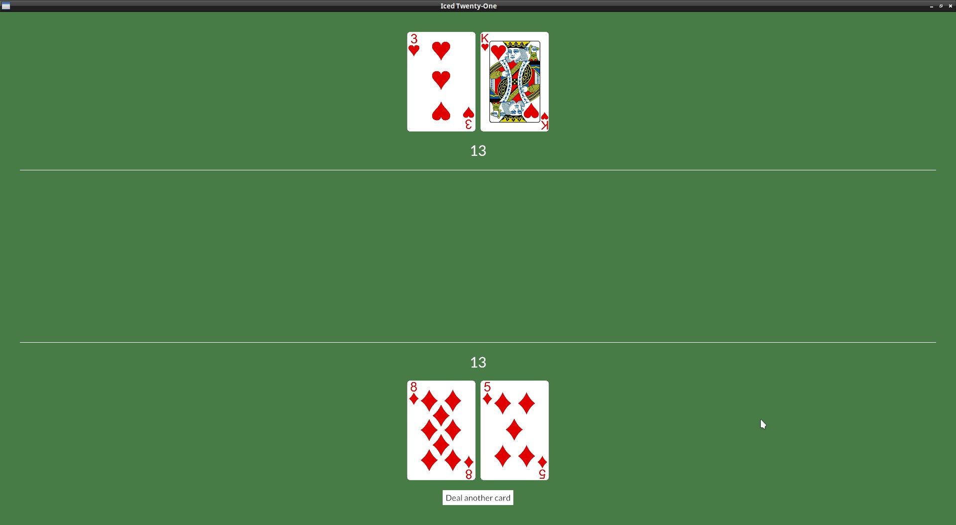
We can't keep getting cards forever, we need to have a button to stand when we are happy with our hand. For now we can show the dealer's face down down card when we do that.
Let's include this part of the game in our GameStage enum:
#[derive(PartialEq)]
enum GameStage {
    Init, Dealing, Standing
}
Add the Message to be send when when we click on "Stand":
#[derive(Debug, Clone, Copy)]
enum Message {
    Start,
    DealCard,
    Stand,
}
Include the button in the Column we create when dealing (it would be nice for the buttons to be side by side, so add them to a Row) :
col![
    Rule::horizontal(4.),
    text(self.player_hand.value().to_string()).size(35),
    player_row,
    row![
        button(text("Deal another card")).on_press(Message::DealCard),
        button(text("Stand")).on_press(Message::Stand),
    ].spacing(30),
].width(Length::Fill).align_items(iced::Alignment::Center).spacing(20)
Let's add the Message processing to our update():
fn update(&mut self, message: Self::Message) -> Command<Self::Message> {
    match message {
        Message::DealCard => {
            if let Some(new_card) = self.deck.deal_card() {
                self.player_hand.push(new_card);
            }
        } Message::Start => {
            self.game_stage = GameStage::Dealing;
        } Message::Stand => {
            self.game_stage = GameStage::Standing;
        }
    }
    Command::none()
}
Now that we know when to show the dealer's card, we can just add it to our view(), we need to remember to show their hand value too, so we separate this in a variable and pass that to iced's text() function later:
let mut dealer_hand_val = String::from("?");
let mut dealer_row = Row::new().spacing(10);
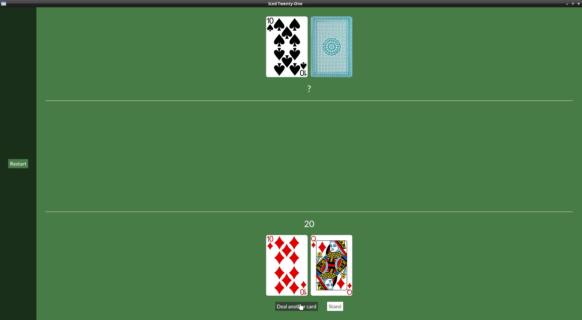
if self.game_stage == GameStage::Init || self.game_stage == GameStage::Dealing {
dealer_row = dealer_row
.push(image(String::from("img/") + &self.dealer_hand.cards[0].get_id() + ".png").height(Length::Fixed(200.)))
.push(image(String::from("img/back.png")).height(Length::Fixed(200.)));
} else {
for card in &self.dealer_hand.cards {
dealer_row = dealer_row.push(image(String::from("img/") + &card.get_id() + ".png").height(Length::Fixed(200.)));
}
dealer_hand_val = self.dealer_hand.value().to_string();
};
let dealer_info = container(
col![
dealer_row,
text(dealer_hand_val).size(35),
Rule::horizontal(4.),
].width(Length::Fill).align_items(iced::Alignment::Center).spacing(20)
).height(Length::Fill).align_y(Vertical::Top);
Disable "deal card" button
If we stand, we shouldn't be able to get more cards, do you remember how to disable a button?
Similar to what we did before, in our player_info_col definition, in our else clause, let's start our row of buttons in a separate variable and include it in the Column later (click on the eye icon to see a few more lines for context if you want):
let player_info_col = if self.game_stage == GameStage::Init {
   col![
       Rule::horizontal(4.),
       text("?").size(35),
       row![
           image(String::from("img/") + &self.player_hand.cards[0].get_id() + ".png").height(Length::Fixed(200.)),
           image(String::from("img/back.png")).height(Length::Fixed(200.)),
       ].spacing(10),
       button(text("Start Game")).on_press(Message::Start),
   ].width(Length::Fill).align_items(iced::Alignment::Center).spacing(20)
} else {
    let btn_row = if self.game_stage == GameStage::Dealing {
        row![
            button(text("Deal another card")).on_press(Message::DealCard),
            button(text("Stand")).on_press(Message::Stand),
        ].spacing(30)
    } else {
        row![
            button(text("Deal another card")),
            button(text("Stand")),
        ].spacing(30)
    };
    let mut player_row = Row::new().spacing(10);
    for card in &self.player_hand.cards {
        player_row = player_row.push(image(String::from("img/") + &card.get_id() + ".png").height(Length::Fixed(200.)));
    }
    col![
        Rule::horizontal(4.),
        text(self.player_hand.value().to_string()).size(35),
        player_row,
        btn_row,
    ].width(Length::Fill).align_items(iced::Alignment::Center).spacing(20)
};
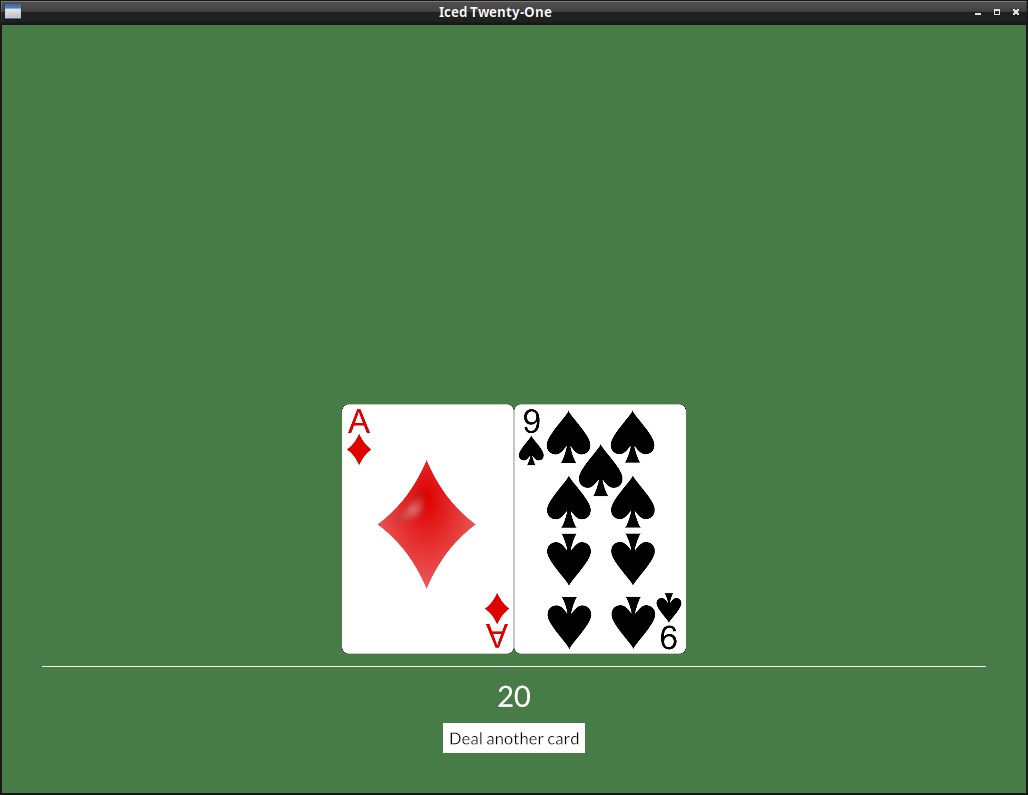
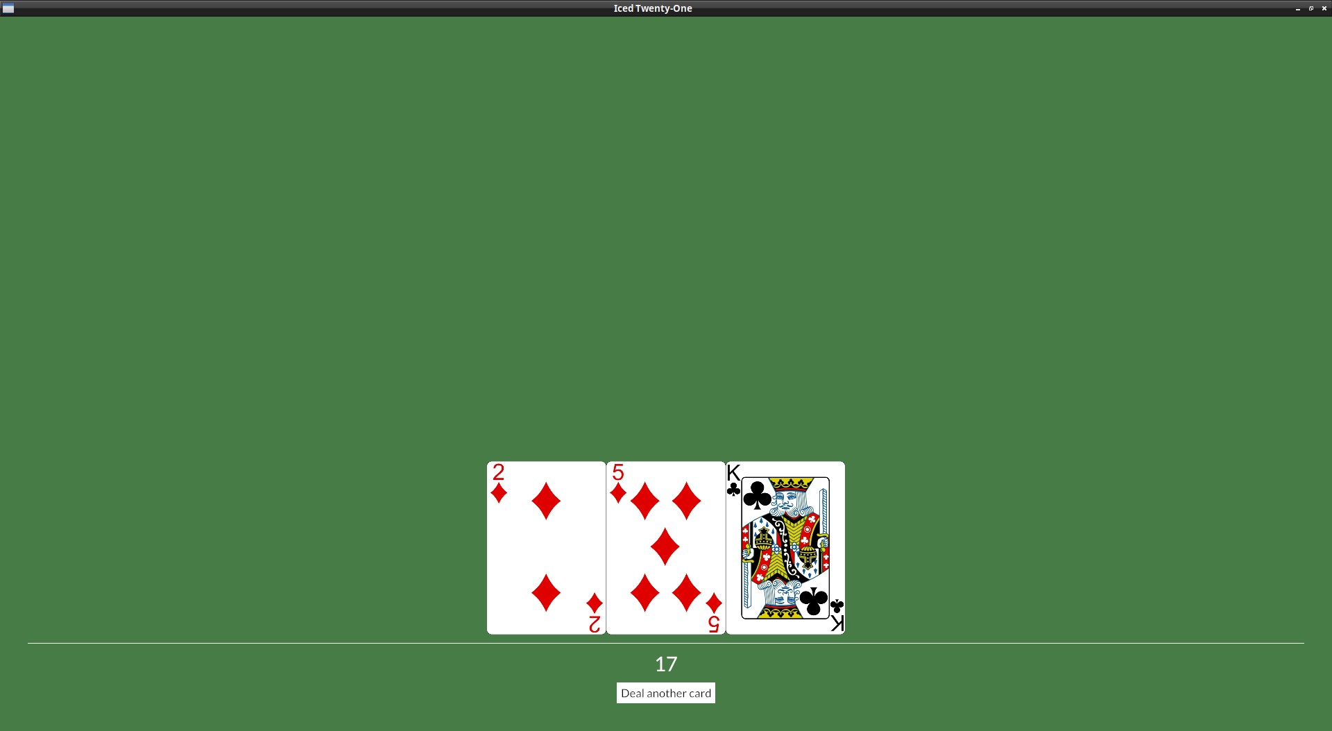
Checking for result when dealing player's cards
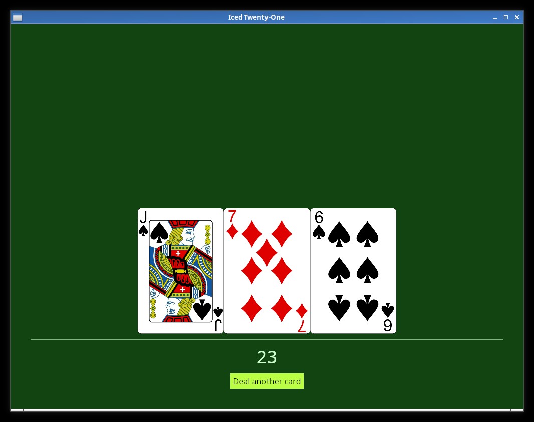
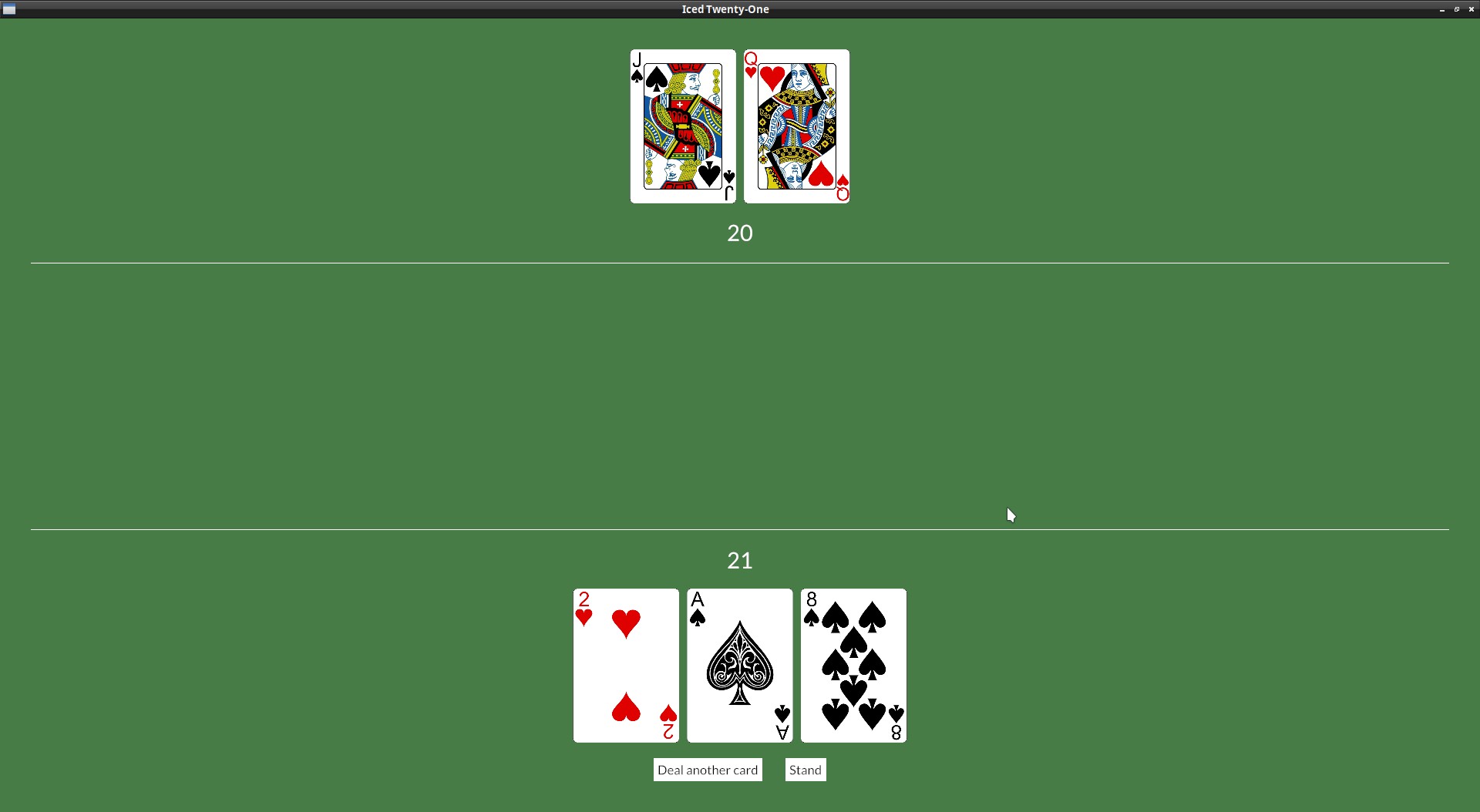
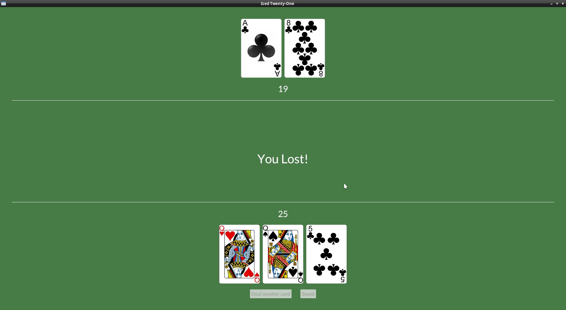
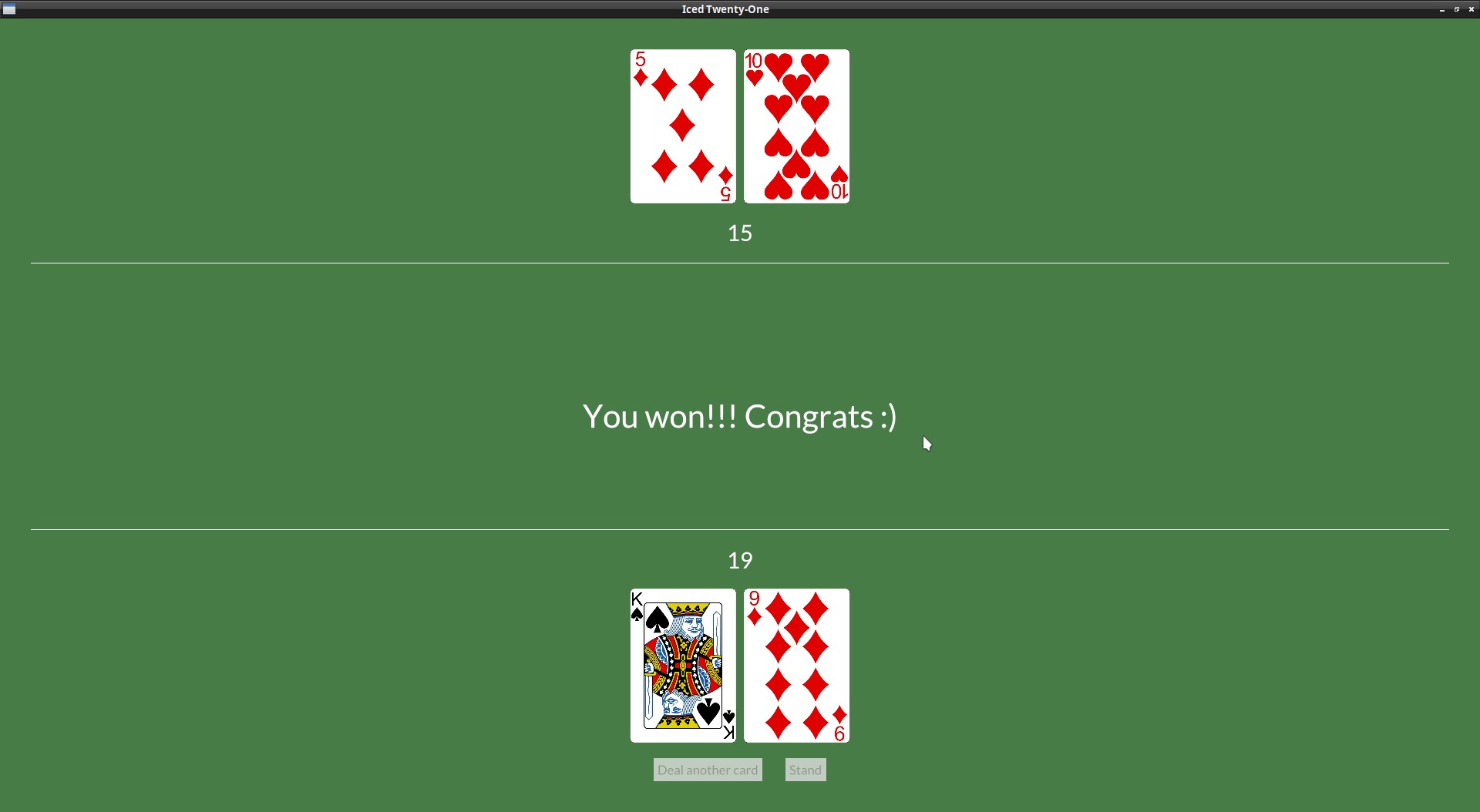
It's finally time to start checking for the game result, we'll start to check for bursts or 21 after we draw a card to the player.
Let's include the possible results to our game_stage enum:
#[derive(PartialEq)]
enum GameStage {
    Init, Dealing, Standing, PlayerWon, HouseWon, Tie
}
And set this accordingly in our update():
Message::DealCard => {
    if let Some(new_card) = self.deck.deal_card() {
        self.player_hand.push(new_card);
        if self.player_hand.value() == 21 {
            if self.dealer_hand.value() == 21 {
                self.game_stage = GameStage::Tie;
            } else {
                self.game_stage = GameStage::PlayerWon;
            }
        } else if self.player_hand.value() > 21 {
            self.game_stage = GameStage::HouseWon;
        }
    }
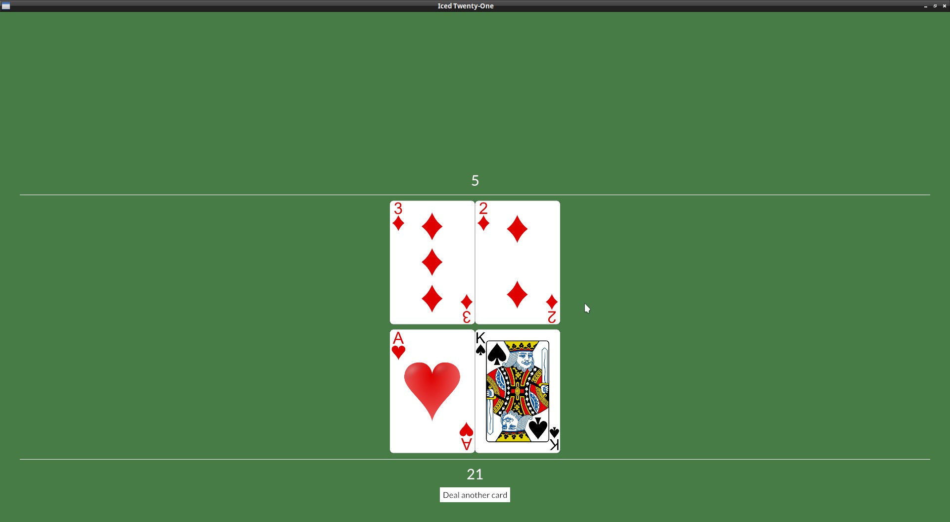
Now, in our view we can create a Text widget that will show the result:
fn view(&self) -> Element<Message, iced::Renderer<theme::TwentyOneTheme>> {
let mut dealer_hand_val = String::from("?");
let mut dealer_row = Row::new().spacing(10);
let mut game_result = text("");
if self.game_stage == GameStage::Init || self.game_stage == GameStage::Dealing {
dealer_row = dealer_row
.push(image(String::from("img/") + &self.dealer_hand.cards[0].get_id() + ".png").height(Length::Fixed(200.)))
.push(image(String::from("img/back.png")).height(Length::Fixed(200.)));
} else {
if self.game_stage == GameStage::PlayerWon {
game_result = text("You won!!! Congrats :)").size(50);
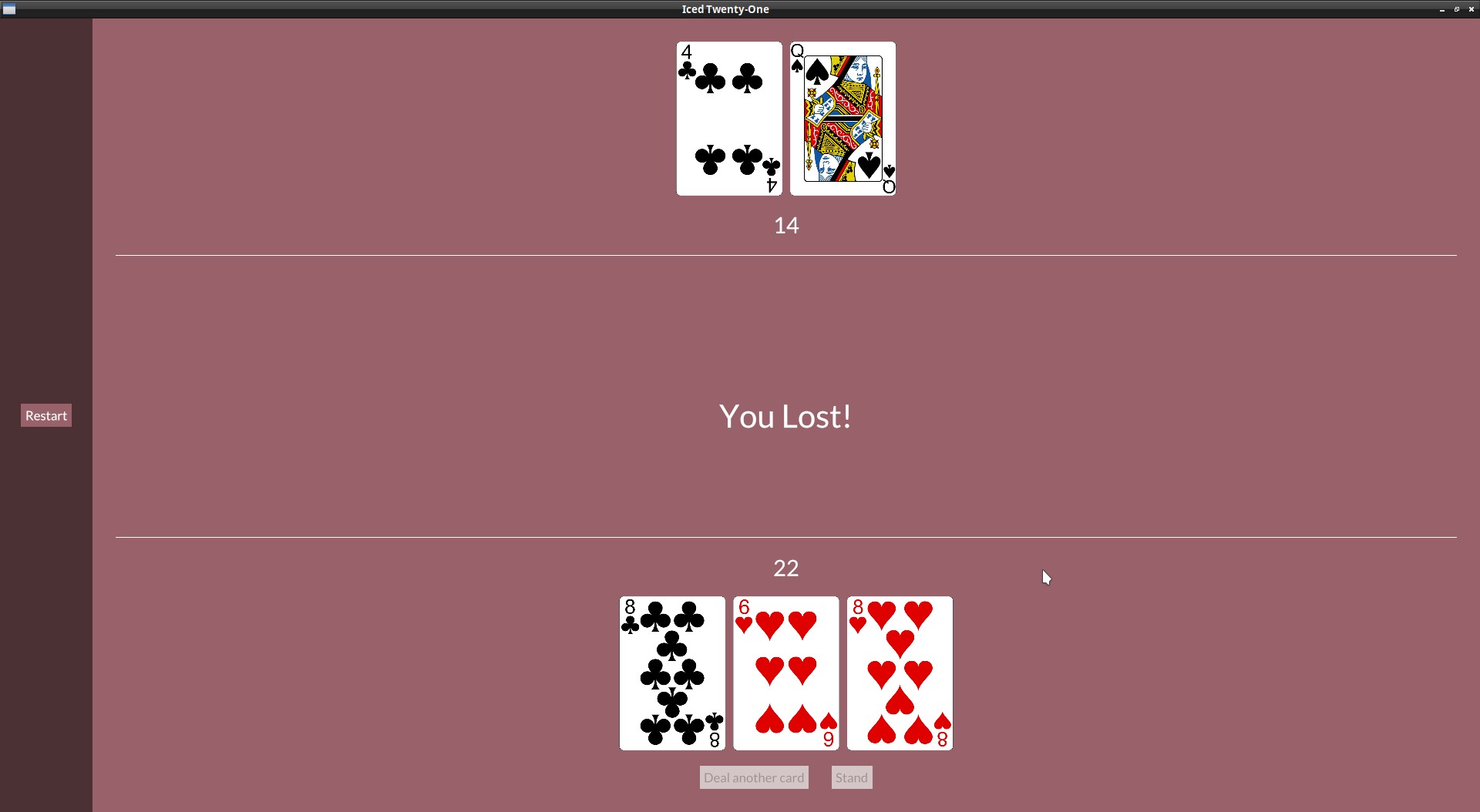
} else if self.game_stage == GameStage::HouseWon {
game_result = text("You Lost!").size(50);
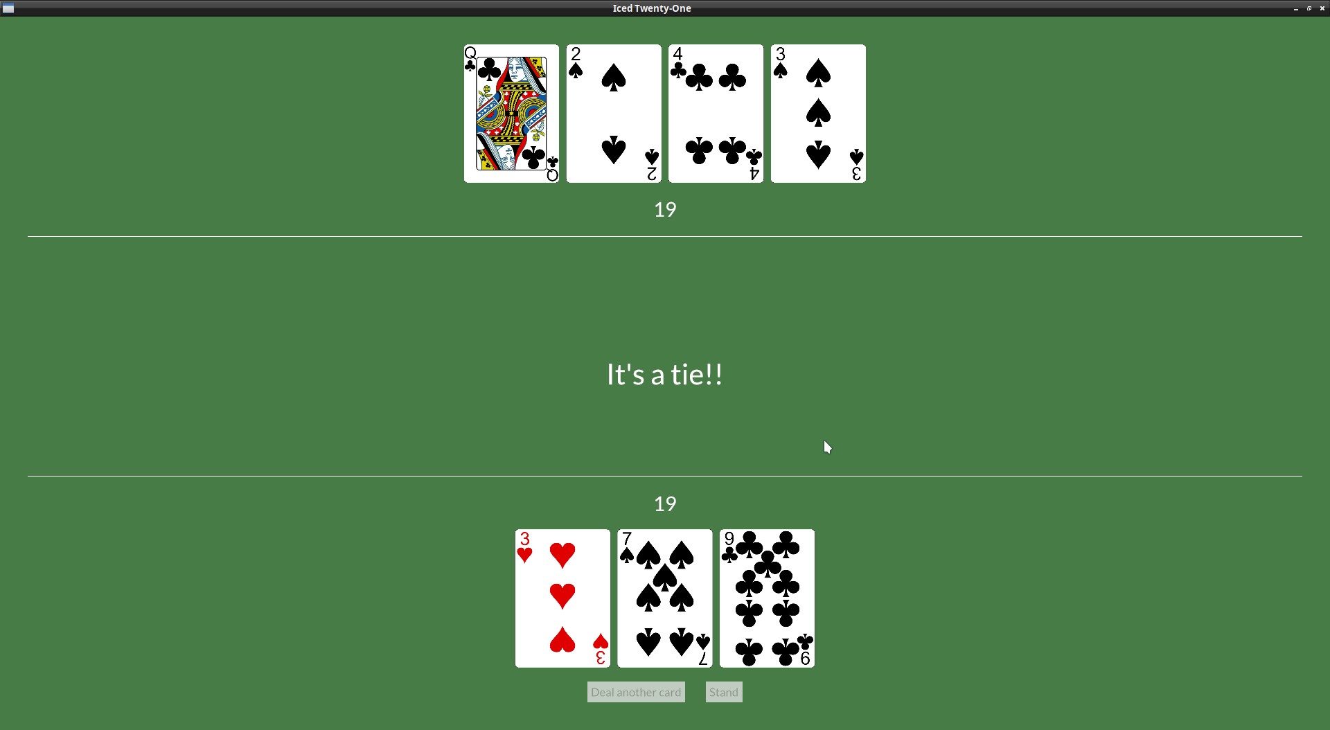
} else if self.game_stage == GameStage::Tie {
game_result = text("It's a tie!!").size(50);
}
for card in &self.dealer_hand.cards {
dealer_row = dealer_row.push(image(String::from("img/") + &card.get_id() + ".png").height(Length::Fixed(200.)));
}
dealer_hand_val = self.dealer_hand.value().to_string();
};
With the Text ready, we can just add it to our table_col:
let table_col = col![
    dealer_info,
    game_result,
    player_info,
].align_items(iced::Alignment::Center).spacing(10);
Check for result when player stands
Now let's continue with the endgame scenarios and check the hand values after the player stand, we can just add the logic to our update():
} Message::Stand => {
    self.game_stage = GameStage::Standing;
    if self.dealer_hand.value() == self.player_hand.value() {
        self.game_stage = GameStage::Tie;
    } else if self.dealer_hand.value() > self.player_hand.value()  {
        self.game_stage = GameStage::HouseWon;
    } else {
        self.game_stage = GameStage::PlayerWon;
    }
}
Since we already have the view prepared, this was all we needed.
Let dealer draw cards: A Subscription
The game isn't very fair right now, the dealer should be able to get more cards too.
And it would be a bit boring to just add all cards they want all at once, it would be better if we added them one by one, this isn't the main use of it, but it's a good time to introduce the iced Subscription.
A Subscription is used when you need to listen (without blocking the GUI) to external events, like window events, listening to an external process stdout, getting data from a device or a network connection, etc...). You run the Subscription and the Subscription thread will keep running and sending Messages to your application when necessary.
Here our use case is super simple, we will have a Subscription that produces a message at a set interval and will deal a new card to the dealer each time until they no longer need more. iced_futures has a every() function that does just that.
For more normal use cases, you would probably want to use the subscription::channel() function that will run your code (which should be an async Stream). It's a complicated thing if you're not familiar with async code, but on iced's discord and discourse you can find a bunch of discussions about this and also get help in case you need.
But let's prepare the game logic first, we need to define the Message the subscription will return to us when it's time to deal another card to the dealer, don't worry about the argument it receives, the every() function returns the time that has passed in case we need, but we don't care about it in this case:
#[derive(Debug, Clone, Copy)]
enum Message {
    Start,
    DealCard,
    Stand,
    DealerDraw(Instant),
}
I think using blackjack's rule about the dealer hitting on a hand lower than 17 works nicely here too. We can keep our game_stage field at "Standing" and draw cards until we have a result.
We're also processing the DealerDraw(_) message on our update(), no mysteries there, just draw a card and check if we got a result.
} Message::Stand => {
    self.game_stage = GameStage::Standing;
    if self.dealer_hand.value() == self.player_hand.value() {
        self.game_stage = GameStage::Tie;
    } if self.dealer_hand.value() > self.player_hand.value()  {
        self.game_stage = GameStage::HouseWon;
    } else if self.dealer_hand.value() < 17 {
        self.game_stage = GameStage::Standing;
    } else {
        self.game_stage = GameStage::PlayerWon;
    }
} Message::DealerDraw(_) => {
    self.dealer_hand.push(self.deck.deal_card().unwrap());
    if self.dealer_hand.value() > 21 {
        self.game_stage = GameStage::PlayerWon;
    } else if self.dealer_hand.value() > self.player_hand.value()  {
        self.game_stage = GameStage::HouseWon;
    } else if self.dealer_hand.value() == self.player_hand.value()  {
        self.game_stage = GameStage::Tie;
    }
}
For async stuff Iced has three backends, tokio, async-std, and smol. To use the every() function I mentioned before, we need to choose one of these using the feature of the same name. It doesn't really matter much which one, let's go with tokio here, add it to your Cargo.toml:
iced = {version = "0.10.0", features = ["image", "tokio"] }
Add these new imports to our main.rs:
use iced::Subscription;
use std::time::{Duration, Instant};
use iced::time;
This will be our Subscription function (it's an optional method of the application trait), place it under the view():
fn subscription(&self) -> Subscription<Message> {
    match self.game_stage {
        GameStage::Standing => {
            time::every(Duration::from_millis(1000)).map(Message::DealerDraw)
        } _ => Subscription::none(),
    }
}
While the game is at the "standing" stage we keep getting cards for the dealer (which are being processed on our update() and when they don't want more cards we return Subscription::none(). Not calling the subscription anymore is how we stop it.
And that was all we needed.
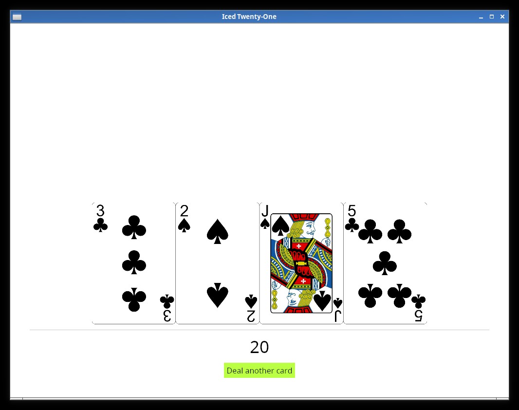
Adding a side column
Just to vary things a bit, let's add a sidebar with a Restart button to don't have to reopen the app to play again. You can try it first if you want, there's nothing we haven't seen before.
This is one way to do it:
let table_col = col![
    dealer_info,
    game_result,
    player_info,
].align_items(iced::Alignment::Center).spacing(10).padding(30);

let menu_col = col![
    container(
        button(text("Restart")),
    ).height(Length::Fill).center_y().width(Length::Fill).center_x()
].align_items(iced::Alignment::Center).spacing(10).width(Length::Fixed(120.));

let row_ui = row![menu_col, table_col];

container(row_ui)
    .width(Length::Fill)
    .height(Length::Fill)
    .center_y()
    .into()
we create a new Column (our sidebar) and add it and our "table_col" to a new Row.
You may have noticed that I also switched the padding from the main Container to the table_col, since it was mainly in that area that we wanted to have some sort of margin. In chapter 16 the padding on the main container would cause an issue, you may leave it there just to see what would happen.
Restart message
You probably are getting used to it by now, we add the new Message:
#[derive(Debug, Clone, Copy)]
enum Message {
    Start,
    DealCard,
    Stand,
    DealerDraw(Instant),
    Restart,
}
Set the button on_press() to generate our Message:
let menu_col = col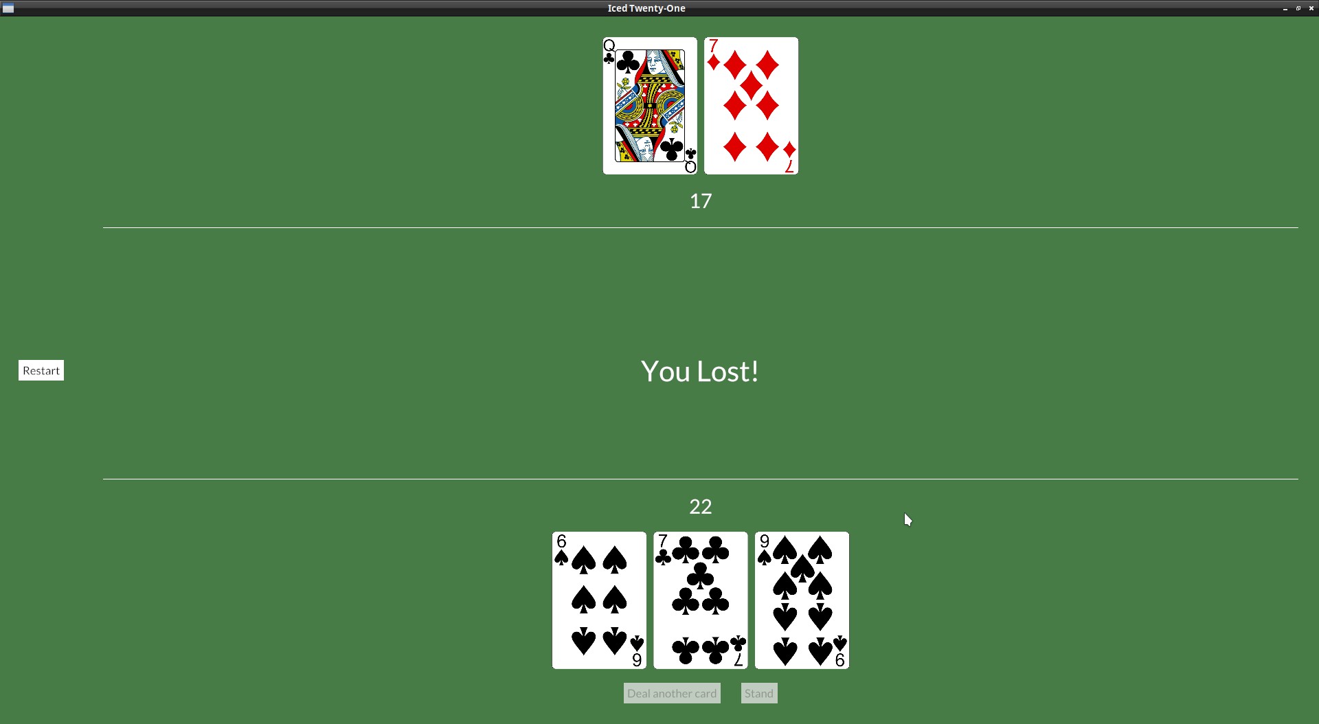
Creating a different button style
Remember when we played with the button's StyleSheet at Chapter 5? We can now do the same but on our own theme.
On our theme.rs, let's add a ButtonStyle enum with 2 variants and set this as our Style type on the stylesheet:
#[derive(Default)]
pub enum ButtonStyle {
    /// No style.
    #[default]
    Table,
    Menu,
}

impl button::StyleSheet for TwentyOneTheme {
    type Style = ButtonStyle;
Now we just need to check which style our button is and set the colors accordingly, so our stylesheet will be like this now:
impl button::StyleSheet for TwentyOneTheme {
    type Style = ButtonStyle;

    fn active(&self, style: &Self::Style) -> button::Appearance {
        match style {
            ButtonStyle::Table => {
                button::Appearance {
                    background: Some(iced::Background::Color(color!(0xFFFFFF))),
                    text_color: Color::BLACK,
                    ..Default::default()
                }
            } ButtonStyle::Menu => {
                button::Appearance {
                    background: Some(iced::Background::Color(color!(0x477c47))),
                    text_color: Color::WHITE,
                    ..Default::default()
                }
            }
        }
    }
    fn hovered(&self, style: &Self::Style) -> button::Appearance {
        match style {
            ButtonStyle::Table => {
                button::Appearance {
                    background: Some(iced::Background::Color(color!(0x324731))),
                    text_color: Color::WHITE,
                    ..Default::default()
                }
            } ButtonStyle::Menu => {
                button::Appearance {
                    background: Some(iced::Background::Color(color!(0xFFFFFF))),
                    text_color: Color::BLACK,
                    ..Default::default()
                }
            }
        }
    }
    fn pressed(&self, _style: &Self::Style) -> button::Appearance {
        self.hovered(_style)
    }
}
It would be nice for the sidebar to look like it's own thing, so let's do the same with the container and create two different styles:
#[derive(Default)]
pub enum ContainerStyle {
    /// No style.
    #[default]
    Table,
    Menu,
}

impl container::StyleSheet for TwentyOneTheme {
    type Style = ContainerStyle;

    fn appearance(&self, style: &Self::Style) -> container::Appearance {
        match style {
            ContainerStyle::Table => {
                container::Appearance {
                    text_color: Some(Color::WHITE),
                    background: Some(iced::Background::Color(color!(0x477c47))),
                    ..Default::default()
                }
            } ContainerStyle::Menu => {
                container::Appearance {
                    text_color: Some(Color::WHITE),
                    background: Some(iced::Background::Color(color!(0x192f19))),
                    ..Default::default()
                }
            }
        }
    }
}
Now that we're setting the color at the container, we can remove it from the application::StyleSheet by setting it to Color::TRANSPARENT:
impl application::StyleSheet for TwentyOneTheme {
    type Style = ();

    fn appearance(&self, _style: &Self::Style) -> application::Appearance {
        application::Appearance {
            background_color: Color::TRANSPARENT,
The "Table" styles are set as the default ones, so in our app code we just need to set the menu ones, let's go back to our col_menu and call .style() to specify which style we want:
let menu_col = col![
    container(
        button(text("Restart")).on_press(Message::Restart).style(theme::ButtonStyle::Menu),
    ).height(Length::Fill).center_y().width(Length::Fill).center_x().style(theme::ContainerStyle::Menu)
].align_items(iced::Alignment::Center).spacing(10).width(Length::Fixed(120.));
Organizing a palette
Our current theme code works but all those colors spread across the file are not ideal, so let's improve this.
At the end of our theme add a new struct:
#[derive(Debug, Clone, Copy, PartialEq)]
pub struct TwentyOnePalette {
    pub primary: Color,
    pub secondary: Color,
    pub tertiary: Color,
    pub text_light: Color,
    pub text_dark: Color,
}
Now we can create our current green palette as a constant:
impl TwentyOnePalette {
    pub const GREEN: Self = Self {
        primary: Color::from_rgb(
            0x47 as f32 / 255.0,
            0x7c as f32 / 255.0,
            0x47 as f32 / 255.0,
        ),
        secondary: Color::from_rgb(
            0x32 as f32 / 255.0,
            0x47 as f32 / 255.0,
            0x31 as f32 / 255.0,
        ),
        tertiary: Color::WHITE,
        text_dark: Color::BLACK,
        text_light: Color::WHITE,
    };
}
Let's create a helper function in our TwentyOneTheme to get the palette corresponding to our current theme variant:
#[derive(Debug, Clone, Copy, PartialEq, Eq, Default)]
pub enum TwentyOneTheme {
    #[default]
    Green,
}

impl TwentyOneTheme {
    pub fn palette(&self) -> TwentyOnePalette {
        match self {
            TwentyOneTheme::Green => TwentyOnePalette::GREEN,
        }
    }
}
There's no need for that match right now of course, but we'll create another theme in the next Chapter.
We can now use the colors from the palette instead of using them directly, here's our updated button StyleSheet:
impl button::StyleSheet for TwentyOneTheme {
    type Style = ButtonStyle;

    fn active(&self, style: &Self::Style) -> button::Appearance {
        match style {
            ButtonStyle::Table => {
                button::Appearance {
                    background: Some(iced::Background::Color(self.palette().tertiary)),
                    text_color: self.palette().text_dark,
                    ..Default::default()
                }
            } ButtonStyle::Menu => {
                button::Appearance {
                    background: Some(iced::Background::Color(self.palette().primary)),
                    text_color: self.palette().text_light,
                    ..Default::default()
                }
            }
        }
    }
    fn hovered(&self, style: &Self::Style) -> button::Appearance {
        match style {
            ButtonStyle::Table => {
                button::Appearance {
                    background: Some(iced::Background::Color(self.palette().secondary)),
                    text_color: Color::WHITE,
                    ..Default::default()
                }
            } ButtonStyle::Menu => {
                button::Appearance {
                    background: Some(iced::Background::Color(self.palette().tertiary)),
                    text_color: Color::BLACK,
                    ..Default::default()
                }
            }
        }
    }
And here's our updated container::StyleSheet:
impl container::StyleSheet for TwentyOneTheme {
    type Style = ContainerStyle;

    fn appearance(&self, style: &Self::Style) -> container::Appearance {
        match style {
            ContainerStyle::Table => {
                container::Appearance {
                    text_color: Some(self.palette().text_light),
                    background: Some(iced::Background::Color(self.palette().primary)),
                    ..Default::default()
                }
            } ContainerStyle::Menu => {
                container::Appearance {
                    text_color: Some(self.palette().text_light),
                    background: Some(iced::Background::Color(self.palette().secondary)),
                    ..Default::default()
                }
            }
        }
    }
}
Adding a new theme variant
Now it's very easy to add more color themes, let's add another constant to our TwentyOnePalette:
pub const BURGUNDY: Self = Self {
    primary: Color::from_rgb(
        0x99 as f32 / 255.0,
        0x62 as f32 / 255.0,
        0x6b as f32 / 255.0,
    ),
    secondary: Color::from_rgb(
        0x4b as f32 / 255.0,
        0x30 as f32 / 255.0,
        0x34 as f32 / 255.0,
    ),
    tertiary: Color::WHITE,
    text_dark: Color::BLACK,
    text_light: Color::WHITE,
};
And update our TwentyOneTheme and palette() function accordingly:
#[derive(Debug, Clone, Copy, PartialEq, Eq, Default)]
pub enum TwentyOneTheme {
    Green,
    #[default]
    Burgundy
}

impl TwentyOneTheme {
    pub fn palette(&self) -> TwentyOnePalette {
        match self {
            TwentyOneTheme::Green => TwentyOnePalette::GREEN,
            TwentyOneTheme::Burgundy => TwentyOnePalette::BURGUNDY,
        }
    }
}
Much easier to change color variants with them separated like this than having to copy paste colors everywhere.
You can switch in which variant you put the #[default] to check that both are working, in the next chapter we'll add an option to switch theme in-game.
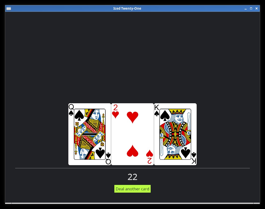
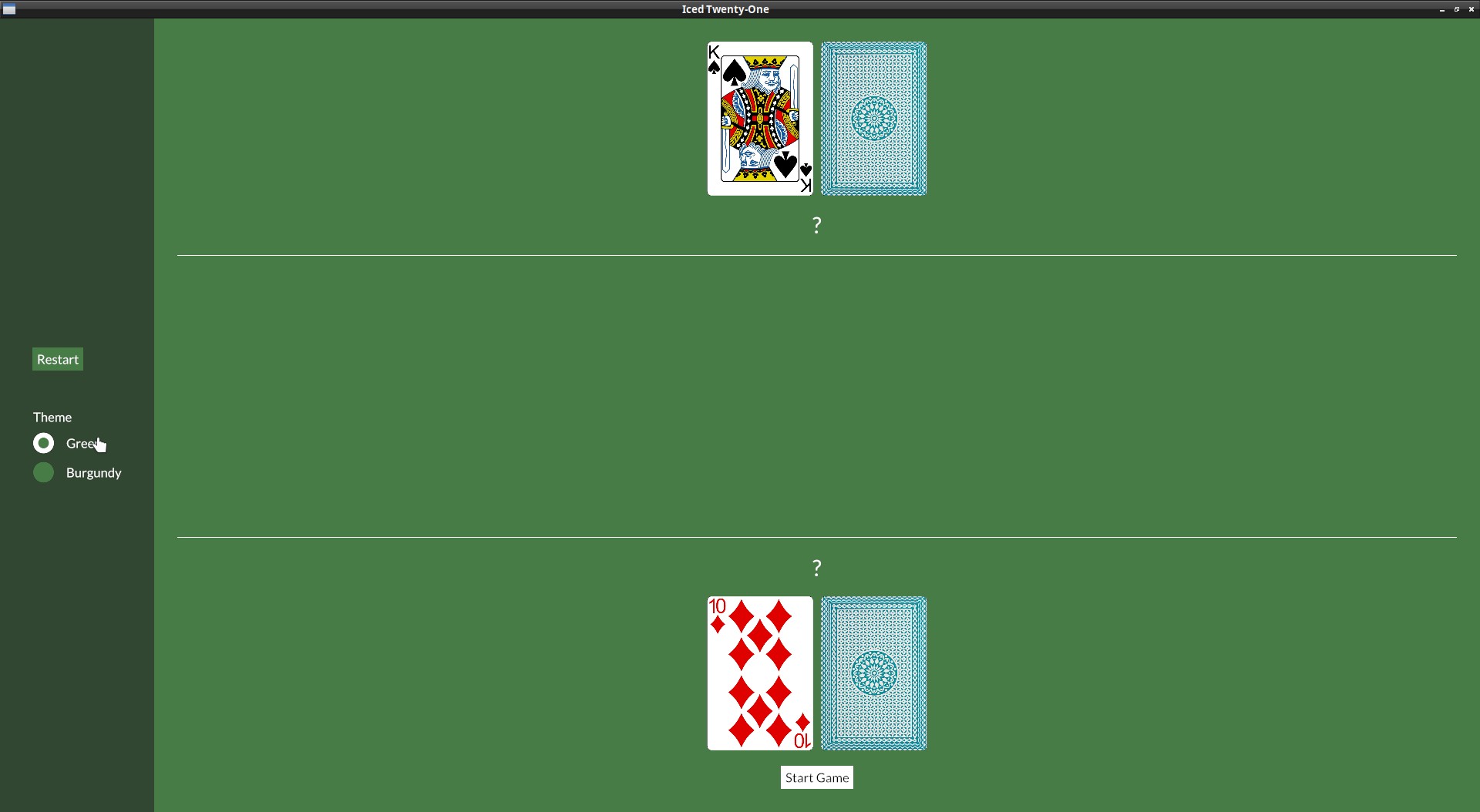
Radio button: Theme switcher
We obviously need an in-game way to switch which theme we want, let's use radio buttons for this.
First of all, in our app state we need to have the theme info, we need to wrap it in an Option to use it with the Radio widget:
struct IcedTwentyOne {
    color_theme: Option<theme::TwentyOneTheme>,
And in the default():
impl Default for IcedTwentyOne {
    fn default() -> IcedTwentyOne {
        let mut deck = Deck::new();
        let mut player = Hand::new();
        let mut dealer = Hand::new();
        deck.shuffle();
        player.push(deck.deal_card().unwrap());
        player.push(deck.deal_card().unwrap());
        dealer.push(deck.deal_card().unwrap());
        dealer.push(deck.deal_card().unwrap());

        IcedTwentyOne {
            color_theme: Some(theme::TwentyOneTheme::default()),
In our view() we can add the Radio buttons, our menu_col will look like this:
let menu_col = col![
    container(
        col![
            button(text("Restart")).on_press(Message::Restart).style(theme::ButtonStyle::Menu),
            Space::with_height(Length::Fixed(30.)),
            text("Theme"),
            Radio::new("Green", theme::TwentyOneTheme::Green, self.color_theme, Message::ChangeTheme),
            Radio::new("Burgundy", theme::TwentyOneTheme::Burgundy, self.color_theme, Message::ChangeTheme),
        ].spacing(10),
    ).height(Length::Fill).center_y().width(Length::Fill).center_x().style(theme::ContainerStyle::Menu)
].align_items(iced::Alignment::Center).spacing(10).width(Length::Fixed(200.));
Notice also the Space widget, it's a widget used just to add empty space between things.
The Radio::new() function takes four arguments:
- The value
- The label
- The current selected value
- The Message it should generate (or a function that generates a
Message)
And now include the "ChangeTheme" Message, which will return us the new theme:
#[derive(Debug, Clone, Copy)]
enum Message {
    Start,
    DealCard,
    Stand,
    DealerDraw(Instant),
    Restart,
    ChangeTheme(theme::TwentyOneTheme),
}
On our update() we just need to set the state to the new value:
} Message::ChangeTheme(theme) => {
    self.color_theme = Some(theme);
}
We also need to start using a custom theme() function in our application again:
fn theme(&self) -> Self::Theme {
    self.color_theme.unwrap()
}
But remember that on our theme we need to have a StyleSheet for all the widgets we're using, so we need to implement the trait radio::StyleSheet to our theme.rs too:
impl radio::StyleSheet for TwentyOneTheme {
    type Style = ();

    fn active(&self, _style: &Self::Style, _is_selected: bool) -> radio::Appearance {
        radio::Appearance {
            background: iced::Background::Color(self.palette().primary),
            dot_color: self.palette().secondary,
            border_width: 0.5,
            border_color: Color::TRANSPARENT,
            text_color: Some(self.palette().text_light),
        }
    }

    fn hovered(&self, _style: &Self::Style, _is_selected: bool) -> radio::Appearance {
        radio::Appearance {
            background: iced::Background::Color(self.palette().tertiary),
            dot_color: self.palette().primary,
            border_width: 0.5,
            border_color: Color::TRANSPARENT,
            text_color: Some(self.palette().text_light),
        }
    }
}
Conclusion
And that's it for this tutorial, I hope it helped you get more familiar with Iced. :)
Iced's discord is a place where you can ask quick questions. Their discourse is a place where you can have longer discussions and is where the developers spend more time.
The docs are also quite good. Iced is split in a number of crates, check especially iced and iced_native:
And of course, the github issues: