Radio button: Theme switcher
We obviously need an in-game way to switch which theme we want, let's use radio buttons for this.
First of all, in our app state we need to have the theme info, we need to wrap it in an Option to use it with the Radio widget:
struct IcedTwentyOne {
    color_theme: Option<theme::TwentyOneTheme>,
And in the default():
impl Default for IcedTwentyOne {
    fn default() -> IcedTwentyOne {
        let mut deck = Deck::new();
        let mut player = Hand::new();
        let mut dealer = Hand::new();
        deck.shuffle();
        player.push(deck.deal_card().unwrap());
        player.push(deck.deal_card().unwrap());
        dealer.push(deck.deal_card().unwrap());
        dealer.push(deck.deal_card().unwrap());

        IcedTwentyOne {
            color_theme: Some(theme::TwentyOneTheme::default()),
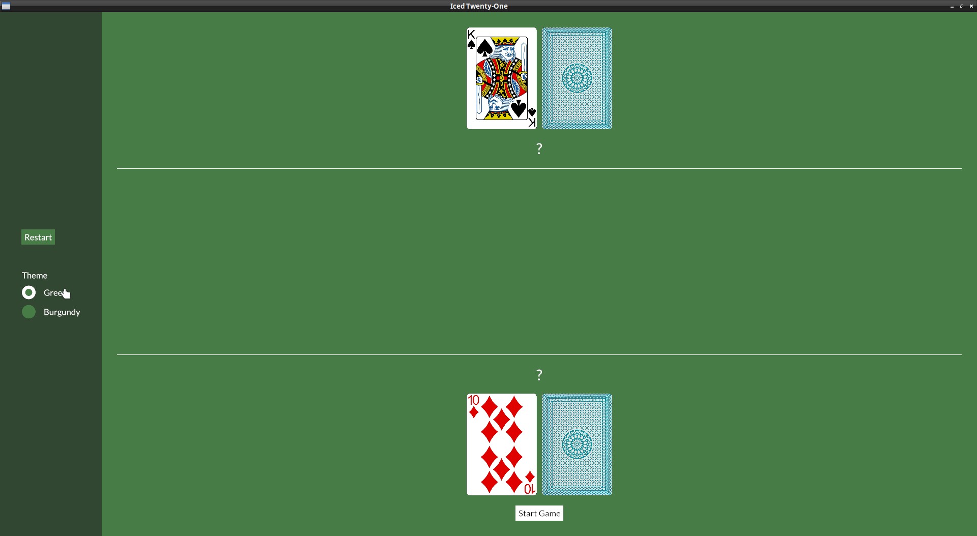
In our view() we can add the Radio buttons, our menu_col will look like this:
let menu_col = col![
    container(
        col![
            button(text("Restart")).on_press(Message::Restart).style(theme::ButtonStyle::Menu),
            Space::with_height(Length::Fixed(30.)),
            text("Theme"),
            Radio::new("Green", theme::TwentyOneTheme::Green, self.color_theme, Message::ChangeTheme),
            Radio::new("Burgundy", theme::TwentyOneTheme::Burgundy, self.color_theme, Message::ChangeTheme),
        ].spacing(10),
    ).height(Length::Fill).center_y().width(Length::Fill).center_x().style(theme::ContainerStyle::Menu)
].align_items(iced::Alignment::Center).spacing(10).width(Length::Fixed(200.));
Notice also the Space widget, it's a widget used just to add empty space between things.
The Radio::new() function takes four arguments:
- The value
- The label
- The current selected value
- The Message it should generate (or a function that generates a
Message)
And now include the "ChangeTheme" Message, which will return us the new theme:
#[derive(Debug, Clone, Copy)]
enum Message {
    Start,
    DealCard,
    Stand,
    DealerDraw(Instant),
    Restart,
    ChangeTheme(theme::TwentyOneTheme),
}
On our update() we just need to set the state to the new value:
} Message::ChangeTheme(theme) => {
    self.color_theme = Some(theme);
}
We also need to start using a custom theme() function in our application again:
fn theme(&self) -> Self::Theme {
    self.color_theme.unwrap()
}
But remember that on our theme we need to have a StyleSheet for all the widgets we're using, so we need to implement the trait radio::StyleSheet to our theme.rs too:
impl radio::StyleSheet for TwentyOneTheme {
    type Style = ();

    fn active(&self, _style: &Self::Style, _is_selected: bool) -> radio::Appearance {
        radio::Appearance {
            background: iced::Background::Color(self.palette().primary),
            dot_color: self.palette().secondary,
            border_width: 0.5,
            border_color: Color::TRANSPARENT,
            text_color: Some(self.palette().text_light),
        }
    }

    fn hovered(&self, _style: &Self::Style, _is_selected: bool) -> radio::Appearance {
        radio::Appearance {
            background: iced::Background::Color(self.palette().tertiary),
            dot_color: self.palette().primary,
            border_width: 0.5,
            border_color: Color::TRANSPARENT,
            text_color: Some(self.palette().text_light),
        }
    }
}