Creating a different button style
Remember when we played with the button's StyleSheet at Chapter 5? We can now do the same but on our own theme.
On our theme.rs, let's add a ButtonStyle enum with 2 variants and set this as our Style type on the stylesheet:
#[derive(Default)]
pub enum ButtonStyle {
    /// No style.
    #[default]
    Table,
    Menu,
}

impl button::StyleSheet for TwentyOneTheme {
    type Style = ButtonStyle;
Now we just need to check which style our button is and set the colors accordingly, so our stylesheet will be like this now:
impl button::StyleSheet for TwentyOneTheme {
    type Style = ButtonStyle;

    fn active(&self, style: &Self::Style) -> button::Appearance {
        match style {
            ButtonStyle::Table => {
                button::Appearance {
                    background: Some(iced::Background::Color(color!(0xFFFFFF))),
                    text_color: Color::BLACK,
                    ..Default::default()
                }
            } ButtonStyle::Menu => {
                button::Appearance {
                    background: Some(iced::Background::Color(color!(0x477c47))),
                    text_color: Color::WHITE,
                    ..Default::default()
                }
            }
        }
    }
    fn hovered(&self, style: &Self::Style) -> button::Appearance {
        match style {
            ButtonStyle::Table => {
                button::Appearance {
                    background: Some(iced::Background::Color(color!(0x324731))),
                    text_color: Color::WHITE,
                    ..Default::default()
                }
            } ButtonStyle::Menu => {
                button::Appearance {
                    background: Some(iced::Background::Color(color!(0xFFFFFF))),
                    text_color: Color::BLACK,
                    ..Default::default()
                }
            }
        }
    }
    fn pressed(&self, _style: &Self::Style) -> button::Appearance {
        self.hovered(_style)
    }
}
It would be nice for the sidebar to look like it's own thing, so let's do the same with the container and create two different styles:
#[derive(Default)]
pub enum ContainerStyle {
    /// No style.
    #[default]
    Table,
    Menu,
}

impl container::StyleSheet for TwentyOneTheme {
    type Style = ContainerStyle;

    fn appearance(&self, style: &Self::Style) -> container::Appearance {
        match style {
            ContainerStyle::Table => {
                container::Appearance {
                    text_color: Some(Color::WHITE),
                    background: Some(iced::Background::Color(color!(0x477c47))),
                    ..Default::default()
                }
            } ContainerStyle::Menu => {
                container::Appearance {
                    text_color: Some(Color::WHITE),
                    background: Some(iced::Background::Color(color!(0x192f19))),
                    ..Default::default()
                }
            }
        }
    }
}
Now that we're setting the color at the container, we can remove it from the application::StyleSheet by setting it to Color::TRANSPARENT:
impl application::StyleSheet for TwentyOneTheme {
    type Style = ();

    fn appearance(&self, _style: &Self::Style) -> application::Appearance {
        application::Appearance {
            background_color: Color::TRANSPARENT,
The "Table" styles are set as the default ones, so in our app code we just need to set the menu ones, let's go back to our col_menu and call .style() to specify which style we want:
let menu_col = col![
container(
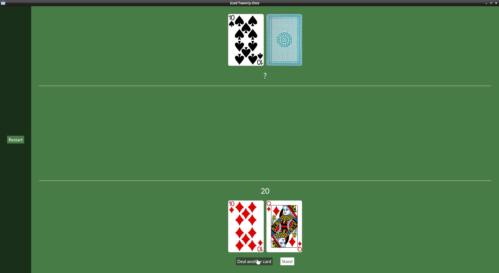
button(text("Restart")).on_press(Message::Restart).style(theme::ButtonStyle::Menu),
).height(Length::Fill).center_y().width(Length::Fill).center_x().style(theme::ContainerStyle::Menu)
].align_items(iced::Alignment::Center).spacing(10).width(Length::Fixed(120.));